Excel – Create a Dynamic 12 Month Rolling Chart
If like many people producing reports at work you report on a rolling yearly basis, you are probably manually changing the data range of your chart every month too either by changing the cell references or even worse, deleting the first month of data and adding the most recent data to the end of your table. All time consuming, and ultimately unnecessary.
It is possible to create a dynamic 12 month rolling chart that automatically displays the last 12 months of data (or any other time frame in fact). All you have to do is add data to the end of your data table and let Excel do the rest!
For this you will need to use the OFFSET function. If you are not familiar with this function, then go to my “Creating Dynamic Ranges” blog ( http://wp.me/p2EAVc-9Y ) to understand how this function works before tackling this…otherwise this will be a complete mystery and quite unfathomable.
Let’s start with some basic data – one year of sales figures.

Basic data table
To create a dynamic chart using this simple table we will need two named dynamic ranges – one for the data itself and one for the labels. Note that when working with charts you will need to create a separate dynamic range for each series as charts treat each series separately so you cannot create a single dynamic named range that includes all rows and columns.
Personally, I like to start by creating the dynamic range that handles the data.
Go to NAME MANAGER and select NEW, or go to DEFINE NAME. Give the range a name of some sort. In this example I will use ChtData. Don’t use the word Chart in your name, apparently it won’t work (Mr Excel).
In the refers to box enter the following formula;

Dynamic range formula to select 12 months of data
We use -12 in the HEIGHT argument as we always want to count back 12 rows from the last cell containing data.
Then we need a dynamic named range to pick out the correct labels (in this case dates) to match the dynamically selected data. In this example let’s call it ChtLabels.
Following the same steps as above enter the following formula;

Dynamic range formula to select the correct date labels
Rather than work everything out from another reference cell, we can use our ChtData range as the reference point or in this case reference range. This will work out what to select based on the first dynamic range, and select values from one column to the left (WIDTH argument = -1).
Check that both ranges work properly by adding some new data at the bottom of the chart and click into the refers to box of the named range to see which cells it selects.
Now time to create our chart. Just follow the usual steps to create a chart…INSERT, CHART etc.
Once our “static” chart is set up, now comes the clever bit.

Select Data icon on the ribbon
Make sure you have clicked on your chart and then click on SELECT DATA.

Edit data source window
In the SELECT DATA SOURCE window, click on the series you want to turn into a dynamic one. If you have multiple series, then you will need to do the following steps for each one.
Click on EDIT.
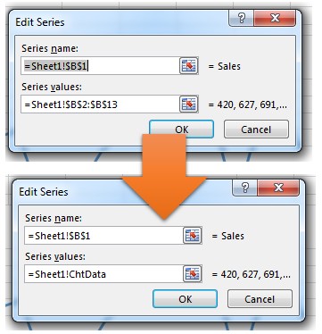
Original and updated range reference
Currently you should see the cell references relating to the series in the SERIES VALUES box. Remove any cell references but leave the sheet name and exclamation mark. Replace the cell references with the dynamic range name for the data – in this example ChtData. Click on OK. Now do the same for the labels.
Click on any one of the labels under HORIZONTAL (CATEGORY) AXIS LABELS and then click on EDIT.
As before, remove any cell references from AXIS LABEL RANGE, leaving the sheet name and exclamation mark exactly as before. So in this example we should now have Book1!ChtLabels.

Amended label range reference
All ready to go! Now just add new data and watch your chart automatically update to always show the last 12 months of data.

Completed chart with extra data but still only showing most recent 12 months
Posted on July 15, 2014, in Charts, Functions & Formulas and tagged charting, charts, dynamic charts, msexcel, OFFSET function, rolling chart. Bookmark the permalink. 97 Comments.

Thanks for this: it works. The next thing I’ve got to try is to turn it round (my labels and data go across columns, not down rows). If anyone knows how to do this, please say so. Otherwise, I’m replacing things and seeing how it works…
Right. Sorted it. I found in chtdata, you had to set it as -13, not -12, to get a full 12 months: =OFFSET(Sheet1!$B$1,COUNT(Sheet1!!$B:$B),0,-13,1) (There’s also a typo: in your 6th illustration, that ought to show Sheet1, not Book1). If anyone wants a horizontal version of this vertical layout, please drop me an e-mail.
Cheers for the typo bit…the illustration is correct as there is nothing you can do about that…that’s Excel doing that bit so have amended the accompanying text. As for the -12 vs -13 I retested the function on the same layout of data and -12 worked fine. If you use COUNTA then then you will also include the heading as COUNTA counts any cells that contain something whether numerical or not. Using COUNT guarantees that you only count cells that contain numerical values. Counting back or forwards is very much dependent on your reference cell and how you offset from there. People often forget that there is a totals cell at the bottom of a column or end of a row and that should not form part of the rolling 12 month period. As for horizontal tables, I would personally avoid them as much as possible because you instantly restrict the amount of analysis and the tool available to you to carry out quick and complex analysis, although I appreciate that at times this may not be possible or what is usually the case is a manager who has no concept of managing/organising data asks for it that way because it looks “prettier” without realising how many problems they are actually creating. Good luck with creating your dynamic charts!
CB, hope this rings a bell. I tried a horizontal version but didn’t seet to work properly. Would you mind sendin one to me @ bill.todd@fresenius-kabi.com.
Thanks
Sample workbook on its way via email
Company email server blocked the mail any other address to send to?
Looks like it has finally gone through. If you don’t get it let me know and I can try an alternative email address
Hi, I tried from my side but it doesn’t seem to work.
Do you mind sending me a copy for the horizontal version as an example? marcoguido@lapix.ch
Sample on its way by e-mail
having issue with excel changing my sheet reference to the woorkbook name.
my named ranges are correct. When I change the series values in the chart, I select OK and my data goes to nothing. When I go back into the edit serial, the worksheet reference is changed to the workbook name.
Can’t leave pictures of the issue.
Try sending me some screenshots via e-mail to the address I sent the sample file from.
Do you accept credit cards? 🙂
Always open to offers 😉
Hi, Wow this is awesome! i also have some old graphs that I inherited and the data is layed out horizontally. Could you send me a workbook showing how I would adjust for that? Thanks, colleenchambers22@yahoo.com
Colleen, I had a number of requests to deal with this so I added another brief blog on dealing with horizontal data. There’s a link on the page to download a file with an example. Try that first and if you’re still struggling let me know
Thanks for this info. Really useful. However I have a table where I’m adding new data at the TOP each month i.e. the data is ordered from newest at the top to oldest at the bottom. How do I make allowance for this? I tried creating an anchor at the bottom and work up the way but I’m not having any success. Any advice on that would be superb.
Actually this one is easier to resolve than you might think. The dynamic range is not really dynamic at all as you are always looking to get the top 12 (for example) values. If you use a standard named range, however, it shifts each time you add a new line at the top which of course does not help. Still start at the top as your anchor point but fix the return value. Your range should be something along the lines of =OFFSET(Sheet1!$B$1,1,0,12,1) This way your return values will always be 12 or whatever number of cells you want to include in your chart and will always start from the row immediately below the anchor point i.e. the heading in your first data column.Depending on how you want to display your data you may need to adjust the chart layout e.g. dates in reverse order to have most recent date on the left of the chart and set the date axis to cross at maximum date. Final adjustments will be down to what suits you best.
I noticed if I format the labels as date then it adds days that I do not have in the worksheet. I skip weekends but the chart adds them the date as 0. I changed it to text and it works fine so not really a problem just something I noticed.
Odd. Without seeing the data of course I can’t really comment. Perhaps send me a link to the file or a sample and when I get a chance I’ll take a look
what if the data you want to plot (i.e. the stuff in column B) is provided by a formula. The formula returns a blank cell until the data becomes available. However, the dynamic range sees cells with formulas in as non-blank, so they’re still plotted. Is there a way around this?! Thanks
Hi, back from holidays hence why no reply until now. Have done a quick test on some dummy data and it seemed to work fine. Any chance you could send me a sample so I can see what you are doing, then I will understand better what you are trying to achieve?
If you have two sets of data on one graph, for example two different products that you are tracking on one graph, do you have to create two dynamic ranges or can you create one that encompasses both products? This is super helpful thank you!
Because you are creating separate series unfortunately you will need to create a dynamic range for each series although it’s not too difficult as you can base all subsequent ranges on the first one created just like you have to when you create the labels range
Chiming in late, and maybe I’m missing something. We named the first dynamic range ChtData – got that, but whey you add the next dynamic range, i.e. OFFSET(ChtData,0,-1) I don’t see what you named it. I don’t thank you can name two different ranges the same can you? Hey, I’m 68 and still learning after 4 degrees – smile! THANKS TO ANYONE WHO CAN HELP!
Mort in Dallas
p.s. is it that bad to have data horizontally? Cannot find link on here would you please post again – BIG THANKS!
First of all good for you learning new stuff, you’re never too old to learn. The 2nd range is created to pick up the correct labels to match the cells picked out by the first named range. By referring to the first range you are effectively saying look at the size of the first range, and using that pick the same size of cells one column to the left. It’s not necessarily bad to have horizontal I would find it awkward to scroll left and right as do many people. It’s much easier to scroll through large data sets vertically using a mouse scroll wheel. Do whatever you prefer. At the end of the day it’s your spread sheet.
Most appreciate and thank you so much…..ok, call me slow. Promise to not write a book. #1 what is the name of that second range that refers to ChtData? or maybe I’m not understanding where the second OFFSET function goes (your offset write is super). #2 You suggested adding data to “see” if the dynamic range worked….your post seems to imply if you click on the range in the Name Manager, an outline should appear around the selection. I have no such outline and it’s driving me nuts. Again, you are one super communicator!! Mort in Dallas
Will reply tomorrow now if that’s ok Saturday night here and off to fireworks display with family
Family always comes first. Ya’ll enjoy!! thanks. Mort
What you call a range is not critical but a sensible name that reflects the contents of the range does help in terms of knowing which range does what. In this example I’m calling my second named range ChtLabels. I’ve updated the blog to show this, as I refer to it by name later on when creating the chart. The bit about checking your data is a bit of a sanity check to make sure the dynamic named range is working as planned. If you click in the “refers to” box when the dynamic range formula is displayed you should then see the “marching ants” around your data range. This should confirm (or otherwise) that the correct cells are being selected. To double check that this is working OK, add some more data to your data and see if this new data is picked up as expected. In the case of a 12 month rolling range you should always see the last 12 cells being selected. In case you can’t find the link to the horizontal workbook here it is again https://onedrive.live.com/redir?resid=2C036E200F2C8BCF!242&authkey=!AKh4mjBK2AWbTnw&ithint=file%2cxlsx
Should have guessed that “range name” but one never knows. Thanks for your most courteous response. Yes, I did a lil Googling on your “blog” regarding horizontal charting and found it!
Thanks for sending link for other’s may not have found and now they have it right in front of them. I am attempting to develop a running total, but once the 13 month’s data is entered, month 1 disappears and the “Table” refreshes, e.g. original Table would have a running or rolling total from Jan – Dec. Once Jan of the new year is entered, Jan of the previous year is dropped and the running total is for just 12 months. Will keep you posted. Right now I’m simply trying to get the data into the Table via a VBA UserForm, then worry about data manipulation. If you’ve seen this already done, which I’m sure it’s out there somewhere, would appreciate the link. Hate re-inventing the wheel all the time – smile. Best Sunday Wishes from Dallas, TX Mort
No problem. With regards to forms, assuming you have a multi-text box form to fill in all the information, the simplest bit of code would be activecell.value = me.txtbox1.value, activecell.offset(0,1).value = me.txtbox2.value and so on and so forth. You could also consider avoiding a VBA form and use the built in form in Excel itself. You’ll need to add it to the quick access toolbar, click in your data table (making sure it has headings in each column) and excel builds a form for you.
Most simply, a big THANK YOU!! I think I see you also “dabble” in VBA. What is the easiest way to access what you have written about VBA. It seems the way you write, I can understand much better than most of the verbiage on the net, which in my Ph.D. opinion is unequivocally horrible!! Best, Mort in Dallas
If you search by category or tag you should be able to find quite a few bits in both Excel and VBA which I also teach. I will be adding more over time of course. If you have a specific topic you might want me to write about, feel free to make suggestions and I’ll see what I can do.
Thanks sooo very much. I’ve only found one book on Excel Tables and their use in VBA. It is not comprehensive although the authors may beg to disagree. Excel Tables+their use with VBA is a neglected topic in my opinion. Off the cuff, it “seems” that most entries into Excel can in fact be converted into Tables? It also seems that most results form VBA gymnastics go back into a Table. Agree there are sometimes single output.
Strictly my opinion – those that ask questions about VBA express themselves most horribly, and those that attempt to answer those horribly put together questions are equally horrible at writing. However, it could simply be this down-to-earth Tennessee hillbilly, although multidegreed, is too ignorant to understand. I “grew up” in graduate school with the old old Fortran IV and what I refer to as the “real BASIC.” These I understood and could write from scratch. VBA is a mystery to me and I have about 50 books on the topic. I do not like seeing code with no explanation as to what each piece accomplishes. I’d say 99% of the time a question is asked how does one do this or that, and someone else simply provides the code with no explanation other than you wanted a 12 month rolling average and here’s the code.
With all this said….I look most forward to reading your topics on VBA. Heck, it took me years to find out where the reset button was on the VBE. Smile. I have asked and asked, and maybe, just maybe, it is staring me in the face and I don’t know it. Where in blue blazes is a list of all syntax for VBA and an explanation of that syntax? In Fortran IV there was only certain syntax you could use to program and it’s function was beautifully explained. I have yet to find such. If there, no one has made it obvious, or I have simply not comprehended.
Best Sunday Wishes,
Mort in Dallas
When in the VBA editor press F2 and you’ll get a list of all code words. Unfortunately that’s all it really is. Click on any keyword and see its actions/attributes on the right but you can’t really go beyond there apart from the help file that may give some additional info and examples. I must say I am tempted to write a book on VBA showing options that go with each keyword such as all the main colour options – vbRed, vbBlue etc. s there doesn’t seem to anything on the market that does that.
Knew I was missing the boat somewhere…thank you very much for your kindness and patience to teach “an ole dog new tricks”
Best Sunday Wishes, Mort
p.s. cannot wait to play with the F2 in the VBE
Hi, I have set up the dynamic ranges, but when I go in to select data I am getting ‘A formula in this worksheet contains one or more invalid references…”
Check your formula auditing tool trace errors to narrow down your search. From there evaluate formula to see at which point the formula trips up. If the error is in the named range bit then tat will be a bit more difficult to determine. See if you can find the error first and if not get back to me
Was faced with exactly this kind of problem of how-to-stop-wasting-time-updating-chart-data-series-manually, your article helped me 100%!! I was trying to figure it out myself for almost 2 days, got only so far, found your paper – and voilà – problem solved! Really great, thank you very much indeed.
No problem. Glad it helped
Many thanks for this most instructive and ultimately very simple solution of how-to-set-up a rolling chart. Helped me 100%!!
I have now bookmarked your blog as I see a lot of helpful articles regarding Excel, which I am using at work like – constantly – really. 🙂 Thomas
Good day and thanks for this. However, there is one graph type I am having issues with creating a dynamic for. Is there a way to have a grouping on the X axis and still have it dynamic? IE. I have 2 columns for each month. I would like it to be grouped by Month/year for the 2 columns. Lets say Open and Closed.
Without seeing your data it’s a little more difficult but I would suggest making one dynamic range per column of data. This is easier than it sounds as you base any subsequent dynamic ranges on the original range, similar to creating the labels range based on the data range. Try that see if it works for you and your data
Thanks, however, it looks like that didn’t help. The Data is layed out like below. I would like for it to be dynamic like you have above but look like http://www.exceldashboardtemplates.com/wp-content/uploads/2011/09/AxisGroupingMultiTier.png (sorry for linking to another site)
A | B | C | D | E |
Month | Type | App 1 | App 2| App 3|
Jan | Open | 1 | 2 | 9 |
| Closed | 1 | 1 | 8 |
Feb | Open | 10 | 5 | 13 |
| Closed | 6 | 4 | 14 |
Having played with some data today you could achieve this chart using a pivot table and pivot chart but your data would need to be completely rearranged to work
I have used clustered charts and it not showing the full width of chart.. looks like only vertical lines and hard to read it for 3 series chart
3 series should be fine but how many data points are you showing? Would need at least a screenshot of chart and data to try and work out what is happening
this was nice. do u have vba coding for this, because i have many rows and many chart in one sheet. it will be difficult to give separate name for so many row datas
Have you tried using Ctrl + Shift + F3 and let Excel create names for you based on labels in column and/or row headings?
I am having trouble making this work for me.. My Columns need to be the months. and my Rows need to be the ‘sales’ (there is approximately 40-50 items) with 3 cells each (average sale, quantity, % rate). I want to create a 12 month rolling chart like this to avoid manually typing in formulas and updating charts each month. It is a TON of data, so I only want 1 “sale item” per chart, displaying average sale, quantity, % rate each month. is this possible? or is it too much data?
I hope this makes sense.. It has been quite awhile since I worked a lot with Excel! Thanks!
You’ll need to create a named range for each row (sales, %…) etc. From your description I believe you need a horizontal dynamic range rather than a vertical one. So I think you have a bit of work to do but as I’ve described in the blogs once you have one range working all the others are based off it.
I figured it would be quite a bit of work at the beginning, but once its going I think it could save me a lot of time each month! (right now I manually update approximately 60 charts every month)
I’m sure you have much better things to do but would you be willing to help me to just get started? I’m struggling on where to even begin really… I can send you a sample of what I’m working with…..
If you have a Dropbox or one drive account send me a link to download the file and I’ll take a look
https://www.dropbox.com/s/7d7s0tx9fdhyoqf/Trend-Play%21.xlsx?dl=0
This is what I’m dealing with! 🙂 I had to change the information, but its the same style, formulas, ect. as the one I’m working with. If I have to change it that’s fine, I inherited this spreadsheet a few months ago. Thank you very much for taking a look!
https://onedrive.live.com/redir?resid=2C036E200F2C8BCF!630&authkey=!AKiZGzeXNCyfJtQ&ithint=file%2cxlsx
Here is a link to your workbook with a change to one section to show you how you need to set up. I have removed the merge cell in column A (never merge cells…don’t know why this exists!) Also removed the #$% column and put those in the first column along with “chicken”. I have created separate dynamic ranges for # $ and % values. You’ll see how I have used the chicken numbers row and based everything else off that. You can do the same for every animal so setting up a dynamic range for each row should be a relatively quick and simple job. I have added a chart for the chickens using a combi-chart so that your percentages are visible in the chart otherwise they disappear due to their low values. Have a go and see how you get on. Hopefully this will simplify your monthly reporting/updating.
Any joy with this?
is there a way to manipulate the dynamic range to omit negative values and n/a results?
Not that I know of, and I would say that the only way to achieve that would be through VBA. The OFFSET function allows you to start from a fixed or derived location and then it calculates the end or limit of the range but there is no option to ignore certain rows or columns.
https://excelxor.com/2014/09/25/iferror-techniques-for-excluding-certain-values-from-results/ not sure if there is an answer somewhere in here but this was proposed on Twitter when I put the question out there
I am lost! Please help!
I need to create a chart using 1)employes start date which converts to month to display on bar graph 2) date in current role (again converted to month to show comparison on bar graph 3) employees name and workplace
I can’t seem to do this and need guidance ASAP
For starters you’ll need to covert your dates in the spreadsheet. Use custom format mmmm to display the name of the month or perhaps mmm-YY to show month and year. I would then create a new column to concatenate the employee name and location and use that to make up the chart or if that’s not possible use the xy chart labeler to add these once the chart is done. Seeing some sample data and the type of chart would help. Not entirely convinced a bar chart is the best way to go about it though.
Nice post. I study something tougher on completely different blogs everyday. It is going to all the time be stimulating to read content from other writers and follow just a little one thing from their store. I’d favor to make use of some with the content material on my blog whether or not you don’t mind. Natually I’ll provide you with a link on your net blog. Thanks for sharing.
As long as you link back to the original post no problem. Thanks
hello, is there a way to also update the chart title with the changing months, so this doesn’t have to be manually changed??
Add a title to your chart as normal and then type = and a reference cell so if the content of the cell changes it updates the chart title
This works great but my data has empty cells and NA() as a result of calculations and no data entry for that day. Applying this to my application results in an error message of invalid references, etc… How can I apply this to my data?
Is it possible to replace blanks and na() with 0? Would that cause a problem? By using IFERROR or ISBLANK functions you could have something in place allowing the dynamic range to calculate properly
Hello. I’ve got this working and plotting a graph using 6 ranges of data, however my data is staggered. For example, the formula I’ve used is this:
=OFFSET(Stats!$A$58,0,COUNT(Stats!$B$58:$MV$58),1,-52)
As you can see instead of selecting the entire row ($58:$58), I set a specific range, namely ($B$58:$MV$58) however the 52 week range I’ve set using OFFSET -52, actually picks up range KO to MN instead of the KV to MU specified in the formula. I can’t explain why this is happening. Any ideas? Thanks
Without seeing the data it’s difficult to comment but is there a mixture of text and numbers in your column? If that is the case try using COUNTA rather than COUNT and see if that fixes the problem
Hi. Many thanks for the reply. There’s no text in the fields, just numbers. Some are hard keyed are some are formulas for they’re all numbers. Had me scratching my head all afternoon. Worst case, can I send you an example of the data to see if you can crack it? Will try again tomorrow morning though. Thanks again.
See how you get on but if you are still stuck get in touch
I managed to sort it. There was blank cells at the very beginning of the data range. This was causing the end of the range I needed selected to fall short by the number of blank cells present. I’ve zero filled them and it works now.
Last question. Can this method be used to cover multiple selections in one go? For example, instead of $B$50:$Z$50, to have $B$50:$Z$58?? Or do I need to create individual named ranges? Many thanks
You’ll need to do one per range but that’s pretty easy as it’s just an offset referencing the first range you created – like the labels use the data range as a reference point
Hi, Thanks for the info, I have been using it to great benefit for presentations created ffrom within PowerPoint but recently our company updated Office to 2013 and ever since I can’t get it to auto update. I always come up with a naming error. When I “Select Data” and edit the series I get “=[0]!Labels” (labels being the name). When I retype the correct sheet or workbook name the data is updated. It has become very manual – is there an easy solution for this or should I shift to creating the charts completely in Excel and then link them to a PowerPoint? Thanks for all you help.
Although I’ve not tested this fully, if you create a chart in PowerPoint it sets the data in a table so everything is created as Table1[#Headers],[Series 1] rather than cell references which is what may be causing the problem. By linking the chart back to a workbook should in theory eliminate the problem
I can’t seem to have all my charts automated. there seems to be a maximum of 6 will work. The 7th won’t update. If you re build the 7th chart, a previous one will then refuse to update. Any solutions?
Is this 7 dynamic ranges in a single chart or just 7 separate charts?
It is 7 separate charts on one wordbook.
I have 12 charts to update monthly from data in the file. Many of the charts are simple pie charts and I can automate them through various logic functions on the sheet, but I have 7 rolling 12 month charts of which I seem only ever to be able to get 6 to work.
I’ve just created some random data over 10 worksheets in one workbook, created dynamic 12 month rolling ranges for each one for both the data and the labels then created the charts. I then wrote a macro to add a line of data to each table to see if all the dynamic ranges moved as planned….and they did. I have to admit I am baffled by the limitation in your case. Have you included the word Chart in any of the named range names beyond the 6th one? As mentioned in the blog, this is a no no and the dynamic range won’t work properly. Otherwise I cannot think of anything else that might cause this problem.
Thanks for trying. I’m still at a loss. Everything looks identical in the setup of each chart but when I delete the “faulty” one and re insert the chart from first principles, another falls over and I only discover this the next month!
How can I set this up to count from the top down? I want to display data for each month day by day. I am not picky if it has to be hard coded to read 31 days of data for every month.
Are you trying to show all days of only the current month in one chart rather than all days of all months from the start of the data?
this worked great for me. however, I have 30 different columns to get the info from so is there any way to do it putting in an OFFSET for dates just once instead of having to do it for every category?
Unfortunately yes. Each series requires its own range as it does in a normal chart. However once you have your reference range you create all subsequent ranges like you do for the dynamic labels offset(range,0,1) for the next column to the right and just keep going for each new column you want to include. Should take about 5 minutes to do.
Thanks for this, it really helped!
My question though is in regards to sets of data that contain #NA! values. I have a set of data where I want to plot the data for 12 months, even the months that have no data (ex. if I have data for May to Dec, but nothing for Jan to April). For the months with no data I’ve made my formula show #NA! values in those cells so that these values don’t show up in the chart, but this seems to mess up this method because it’s no longer counting numbers only, but numbers and #NA! values.
Thinking off the top of my head it might be worth considering an array formula that excludes errors in a cell somewhere and use that within the offset function rather than using a straightforward counts function
Quite late to this thread, but if I have the months as columns and then various data series in the row, how do i do the formula?
It’s down to logic I’m afraid. Instead of thinking going down the columns you will need to set your offset function to count across and when reading labels for example think about the relative position of the rows rather than the columns as I did in the example in the blog
Can you do a 12 month rolling chart if the data originates in a horizontal excel file verse vertical? So Jan, Feb, Mar ….. left to right with data in the block beneath each month?
It is possible you just have to think about the step movements moving across the table rather than down it. I’ve actually come across someone who not only had horizontal data but also in reverse order with most recent data on the left which was a complete nightmare and only because the manager didn’t want to have to scroll across the worksheet to see the latest data!
I was able to understand and reproduce the the example> When I transpose the data so it goes horizontal I have just not been able to get it correct. Would you have any examples available?