Blog Archives
Basic Charting – How to Create a Chart
On any given day of the week, there are at least a couple of pleas on Twitter for help on how to create charts in Excel. So to assist all of you who have asked, and no doubt for the many who will follow, here are the basics of creating charts in Excel.
First of all make sure your data table is workable. By that I mean make sure that it is one continuous table of data; NO subtotals, NO blank rows/columns within the data, leave a gap of at least 1 row and 1 column around your table, NO double row headings and ideally leave the top left hand corner cell EMPTY. By leaving this cell empty you will avoid a host of potential problems. For basic trouble free charting a simple, basic layout is best.
Or…
Or….
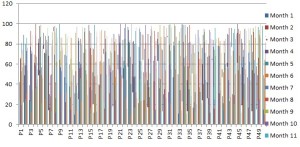
You can have pretty much as many rows and columns as you like but bear in mind that too much data makes it very hard to read the chart.
So limit the data you want to convert to a chart…
Far more sensible and actually easy to view and understand.
Once you have a usable table click somewhere in it. You don’t have to highlight the entire table. As long as you have clicked in the table Excel will work out how many rows and columns make up the data table. Basically it looks around the cell you have clicked in until it finds empty rows and columns which tells Excel it has found the outer boundaries of the data table. That’s why you leave at least 1 row and 1 column between your data table and any other data in your worksheet to avoid including data that is not part of the table you want to base your chart on.
That’s the hard bit out of the way!
You have 2 keyboard shortcuts available to you to instantly create a chart;
- F11 creates a chart in a new chart sheet
- Alt + F1 creates a chart on the same worksheet as your data table (v2007 onwards)
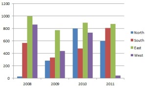
There you are…one chart done and dusted. Using these shortcuts will use whichever chart type is set as the default on your PC. You may well find that the default is a column chart. In fact this is a very good default type to have. Plain, but it works, and usually shows the data in an easy to understand layout.
If you want to change the chart type, make sure you have clicked on the chart to activate it. Once selected you will see 3 new tabs top right hand corner of Excel; DESIGN, LAYOUT and FORMAT.
Make sure you are on the Design tab and over on the far left you will see CHANGE CHART TYPE. Click on that and you will get the full list of available char types. Not all of them are recommended (for a variety of reasons). If you are interested in which charts you should or should not use, check out this blog by Jon Peltier http://peltiertech.com/WordPress/excel-chart-types/
If you want to have a little more input into how your chart is created then start off exactly the same way as above i.e. click somewhere in your data table. Then click on the INSERT tab (if you are using 2003 or earlier, you have the chart wizard to help you. Just click on the chart wizard icon and follow the prompts), and from the Charts group click on one of the chart options, then choose from one of the sub-options that appear. To see the full range of charts click on the launch button in the bottom right hand corner of the group icons.
Now it is simply down to editing the overall appearance of your chart. Once again make sure the chart is activated by clicking on it, then check out the three CHART TOOLS tabs;
- Design: change chart type, pick from a range of preset colour schemes, switch the rows and columns over
- Layout (this is where you’ll do most stuff): add titles, axis labels, position your legend, add series labels, show/hide data/axes/gridlines
- Format: change shape and text styles. Chances are you won’t do much here.
The DESIGN ribbon;
The LAYOUT ribbon;
The FORMAT ribbon;
The only other thing you might want to do is change the appearance of the series and the chart background etc. All you have to do is RIGHT CLICK on any part of the chart and you will get the option to format whichever part of the chart you have clicked on. Choose from the multitude of options available to you. I could go through each one but it’s more fun trying things out for yourself. If it all goes pear shaped just do Ctrl + Z to undo your last change.
And there you have basic charting.
If you want to learn more about charting techniques try out these great websites:
http://chandoo.org/wp/category/visualization/
Follow me https://twitter.com/excelmate on Twitter
Or check out other articles/blogs on http://excelmate.tumblr.com/


