Learn VBA for Excel
Over 10 years of training VBA have helped me put together a book aimed at absolute beginners and novices in VBA. Having seen first hand what excel users, and for the most part non programmers struggle with in class when they’re learning coding I have made a point of highlighting the sorts of common errors people make so that hopefully you can avoid them.
The book entitled “VBA – Turning to the Dark Side of Excel” is available through Amazon in both Kindle and paperback versions. So if you want to learn from a trainer then this is for you. Over 20 chapters starting from the basics through to loops, forms and even working with other applications, there is plenty to get you automating your Excel workbooks.

Planning Simple Projects with Trello or Microsoft Planner
At some point in your working life you will be involved in a project of some sort. The type and size of project will vary wildly from a list of “to-dos” through to multi-site, multi-year projects.
Managing these different projects requires different skills and also different ways of keeping track of things. There are lots of tools available out there. The problem is deciding which one to use.
If you are involved in the likes of managing the building of the Olympic stadia, or a new rail line/network, the likes of Primavera might be best suited, allowing you to build multi-site, multi-project programs. Working on single, long term projects with a requirement to track resources and costs, then something like Microsoft Project or similar might be your best option.
For many of us though, both of these would be a serious case of over-kill. The cost of licences etc. is also prohibitive which in turn means that only a very limited number of people are likely to have access to the information.
So, what is available to you for quick simple projects?
This is where software like Trello, Microsoft Planner or Asana might be the tools for you. They are all very similar in their functionality and for two of them come in either free or paying version. I’m going to look at Trello and Planner.
Trello
This is an online tool. There is a free version and a chargeable version with added functionality beyond the standard free one. You’ll need to create an account and then log in to your account to view the planning boards.
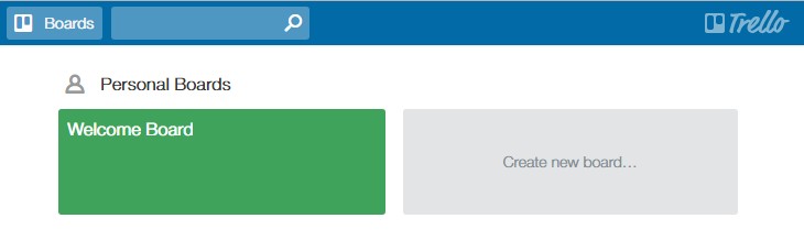
Click on Welcome Board and this opens a useful hints and tips page to give you an overview of everything that can be done within the application.
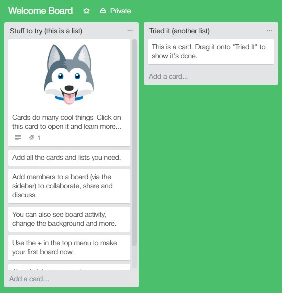
The left hand column has a number of cards with hints and actions to perform to help you discover the basics of Trello.
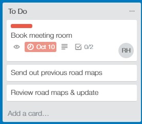
To create a new project, click on CREATE NEW BOARD. This will start what Trello calls a board. Think of this as a notice board where you can pin job cards. Create new cards by clicking on ADD A NEW CARD. Give your task or activity a name and click the ADD button.

Each card that you create can then be edited to add more detail around the job or activity that needs to be completed. To view the details card, click on the job card.
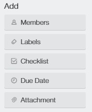
Here, you can add a lot of detail about the task;
- Members – who will complete this task?
- Labels – highlight the task with colour coded labels
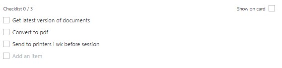
- Checklist – add a task specific to do list
- Due date – when does this need to be completed by?
- Attachment – add any relevant files/images etc.
Using the buttons on the right hand side add as much detail as required.
Members: you can invite people to be part of your project team, and once they are on board, you can assign tasks to them. Each task can have multiple people assigned to it.
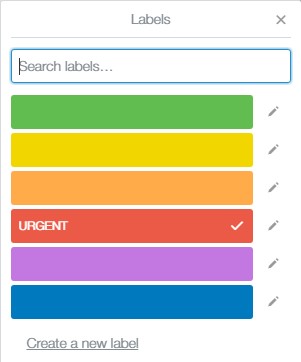
Labels: These are coloured tags that can be assigned to the card. Each tag can be customised with text. There is an option to use colours suitable for colour blind people.
Checklist: add lists of actions that might be required to complete the task. These could just be a list to remind you, or a breakdown of everything that needs to be done.
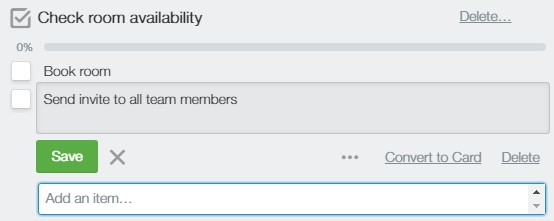
If something on the checklist ends up as quite a big task in its own right you can use CONVERT TO CARD, making it a new, separate task in the project.
Due Date: when does this need to be completed by?
Attachment: add any attachments that might be needed or are relevant to the task in hand.
There is an area for comments. People can add comments, attachments, mention people or add emojis. This gives the task more of a social element where team members can contribute or comment about the task.

If you want to kept up to date with changes etc. in the activity then you can SUBSCRIBE and get notifications.

Depending on how many things you want to display on the card you will see a number of icons etc. showing you a simple visual summary of the activity.
Back on the main board, you have a number of icons on the right hand side:
- People
- Activity
- Power-Ups
- Filter
- Stickers
- Settings
People: displays project team members
Activity: shows any activities that have taken place or comments added.
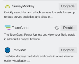
Power-Ups: You can add extra functionality to Trello. If you have the free version, you can only enable one power-up per board. To add more than one then you need to upgrade your account to TRELLO BUSINESS CLASS. There is a long list of power-ups available. Here is just a short sample…
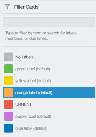
Filter: Use the filter to quickly find things within your project – keywords, tag colour, people or due dates.
Stickers: Click and drag stickers onto your cards.
Settings: A number of options such as changing the background appearance of your board, controlling member permissions etc. Again, there are a number of options that are only available to business class members.
So, what do you get if you choose to use Microsoft Planner?
Planner
If you have used Trello, then using Planner is almost the same. It has the distinct advantage of being fully integrated into Office 365 and all its applications making collaborative working simpler and creates a smooth workflow across multiple applications within a business. Unfortunately, I cannot do a direct comparison to the Business Class version of Trello as I don’t have it. For the purpose of this blog I am more interested in the general functionality of both applications.
To access Planner you need to be using the enterprise version of Office 365. Log in through the portal and click on the Planner icon.
When you open Planner it will take you to the PLANNER HUB or landing view for the application.
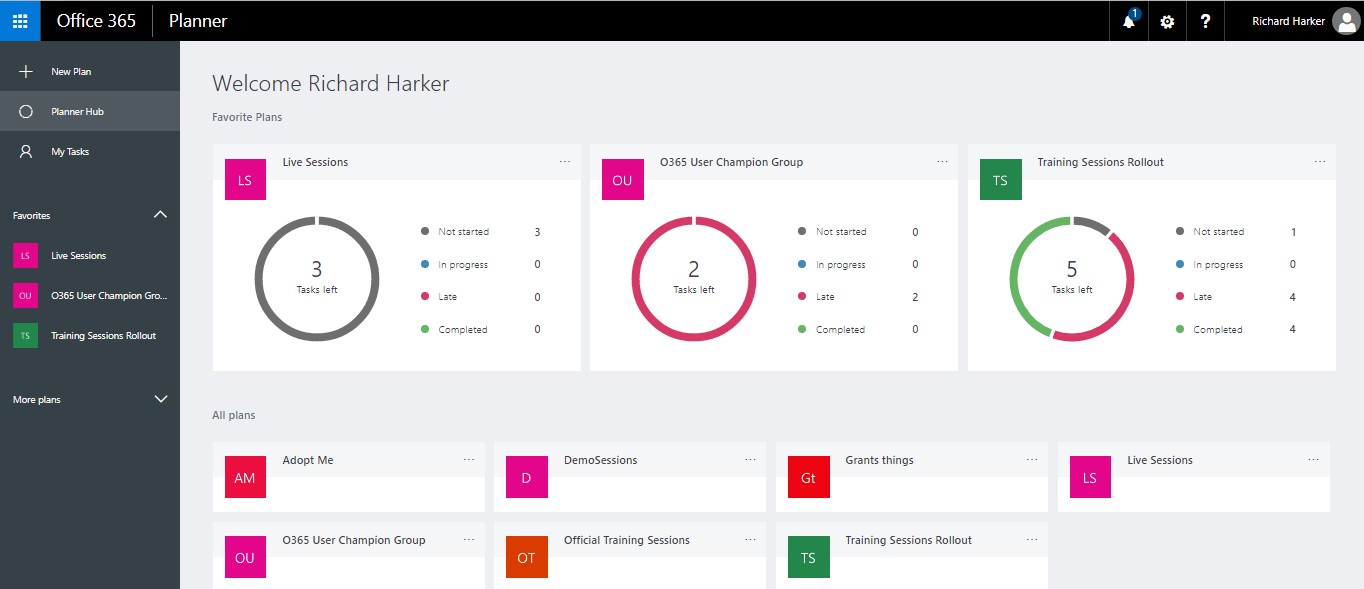
Here you will see any plans that you have either created yourself or are part of. If you are involved in a plan click on the plan name to see the details. If any of your plans are ones that you go to regularly etc. you can make them a favourite by clicking on the three dots next to the name and selecting ADD TO FAVOURITES. This will add a shortcut in the left hand panel as well as display a mini dashboard. Although limited in functionality and detail, it is a useful feature which is not present as a standard feature in Trello (free version).
To remove a plan from your favourites click on the three dots in the mini dashboard and select REMOVE FROM FAVOURITES.
You can create a new PLAN by clicking on NEW PLAN. Complete the details on the new window to name the plan, add an optional description and decide whether you want members to receive mail notifications generated by assigning tasks etc.
Whereas in Trello you create a new board, in Planner you create a plan.
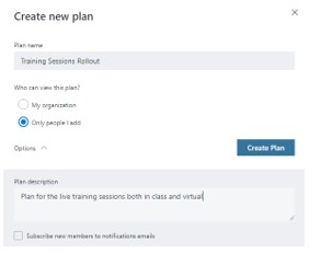
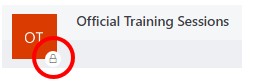
Give your plan a name, and decide whether the plan is open to all to view or limited to team members only. When you look at plans on the PLANNER HUB, any plan icons with a padlock are limited to members only.
Once complete click on CREATE PLAN.
When a new plan is created, a group is set up with its own calendar, mailbox, SharePoint area etc.
When you start a new plan the initial layout and way to get started are the same as Trello. Planner uses BUCKETS. By default, you start with a TO DO bucket where you can add tasks. Think of the buckets as top level summary tasks. You then add detail to each bucket by adding tasks. To add new buckets click on ADD NEW BUCKET.
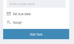
When you create a new plan the default bucket that is created is TO DO. You can rename this by clicking on TO DO and overwriting it to whatever your task summary name you want to give it. To add a task, click on the plus symbol.
You will ned to build a team so tasks can be assigned to the various team members. Click on the MEMBERS arrow and type in the name of someone you want to invite to the plan. As you are linked to the enterprise, the names of every employee should be listed, so just start typing a name and when the name appears click on it to add it to the list.
Now, when you create a task you can name it, select a name or several names to assign the task to, and set a due date. Then click on ADD TASK. This is the bare minimum required. Just like Trello, click on the task card to reveal a details window.
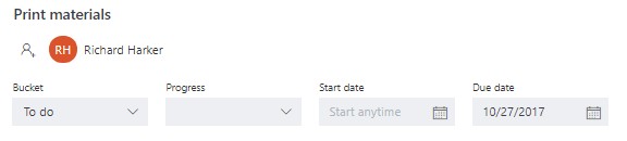
You can set the PROGRESS status for the task (Not started, In progress, Completed). Set a START DATE if necessary.
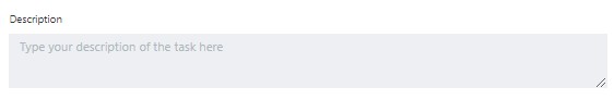
You can add a more detailed description if that is of help.
Add a checklist if you want to break down the task a bit.
Tick the SHOW ON CARD option if you want people to see that there is a checklist.
If an item on the checklist is later considered too big a task to be a checklist item you can convert it into a separate card. Click on the item to select it then click on the PROMOTE ITEM arrow over on the right hand side.
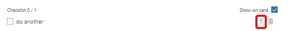
This will convert the checklist item into a new task that can be edited and assigned like any other task.
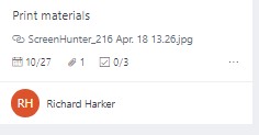
Add any useful or relevant attachments. If you tick the SHOW ON CARD option you will get a preview of the file appearing on the card.

Comments can be added to the task. These will form a conversation within the task.

Depending on the number of options you selected to be displayed on the card you will see something like this for each task. Note that you can only display one of the SHOW ON CARD options at a time at present.
You can switch views from the BOARD with all your buckets and tasks, to the CHARTS view, which is the mini dashboard giving you a quick overview of the plan.
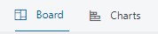
Click on CHARTS to get this;
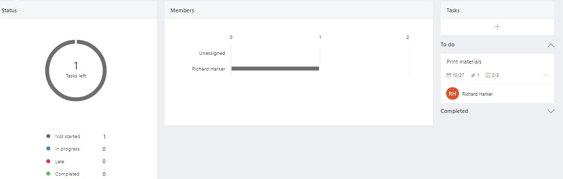
Obviously, the more tasks and assignments you create the more information will be displayed here, but it’s a nice feature to get a quick summary of the plan in a visual format.
Use the drop down GROUP BY option to change how you see your plan’s status.
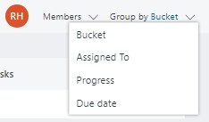
This is a useful feature so you can quickly review your plan’s tasks in a variety of ways. To quickly highlight any tasks assigned to a specific person, go to the MEMBERS area.
Click on the image or the initials of the person whose tasks you want to see and in the window below, any tasks assigned to that person will turn grey.
This will work in any layout view.
So, whether you choose to use Trello, Planner or Asana, it’s down to the individual people who were assigned tasks to do them and update them so everyone involved in the project is aware of what is going on and up to whoever the project manager or equivalent is to oversee everything. At the end of the day, no software, however good, manages a project…people manage projects. The tools are there to hopefully make managing them a bit easier.
If you want to look at Asana for comparison go to Asana.com. This comes in three versions: free, Premium and Enterprise. Below is a screenshot taken from their website. A you can see it has a similar feel and layout to Trello and Planner. As with Trello, some of the neater features such as creating dependencies are only available in the paying versions.

Planner is probably the one with the fewest features at the moment, but is relatively new and there are regular updates so no doubt over time, Planner will add a whole raft of features to bring it more in line with the likes of Trello and Asana. The main advantage that Planner has over the other two is that is fully integrated in the Office 365 suite of applications so working from one application to another is pretty much seamless…you just have to be on an enterprise version of Office 365, whereas the other two are standalone packages.
The choice is yours.
Excel – Applying Conditional Formatting to Charts
Hopefully you are familiar with applying conditional formatting to cells, and creating rules to apply more complex formatting rules. If not, check out my blog to see how you can apply conditional formats to cells.
However, when it comes to charts there is no in-built conditional formatting functionality where you can create some sort of rule and apply it to a series.
In order to create the “illusion” of conditional formatting on charts we have to create some dummy data based on our base data.
Let’s start with a simple table.

Simple sales table
When converted into a chart it gives us this.

Standard chart
As you can see we have a range of products being sold and have different sales figures against each one. To make things stand out a bit more it would be nice to apply some colour coding to the bars of the chart to show which sales are good, bad or indifferent or simply to show on a colour scale how sales are performing.
For this example, let’s say I just want to show a RAG (Red/Amber/Green) system for each product.
First, decide what your break points are going to be i.e. what determines if something should be red, amber or green;
Red <=1500
Amber <= 3500
Green > 3500
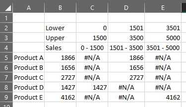
Once we have our break points we can set up our table to create the dummy data.
Add a couple of new lines above your table and if you want, label them something like Lower and Upper to represent the lower and upper bounds of your range of values e.g. 0 to 1500 for red.
It’s worth also adding some labels so that these appear in your legend when you create the chart so people understand the meaning of the colours. In this example, I used the formula = C2&” – “&C3 to build up the label for the red values.

Modified table to create dummy data
Now we build up some IF statements to determine which category the actual value from the base data falls into i.e. Product A should be in the amber section. We will start by creating a nested IF statement in cell C5 (in this example) that will test if the sales value for Product A is between 0 and 1500. If it is, then display the number, otherwise show #NA. We need to have #NA as this prevents anything from being plotted in the chart. By fixing certain elements of the formula (see my blog on absolute vs. relative referencing if you are unsure about what I have done) so that the formula can be copied across the columns and then down the rows ensuring it works in all cases.
=IF($B5>=C$2,IF($B5<=C$3,$B5,NA()),NA())
Once applied to all the cells in the modified table, each sales value for each product should only appear once in the new columns.
Completed dummy data table
Now it’s time to replot the chart but this time using the dummy data.
Highlight all the data apart from the original values.
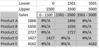
Chart data selected
Use a stacked column chart to display your data and then apply whatever formatting you want to get your end chart.
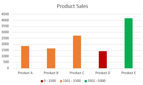
Conditionally Formatted Chart
Because of the way the data has been set up, if any of the values change, the formatting you have applied will automatically change based on the values.

Updated numbers
PowerPoint – Alternatives to Bullet Points
Bullet points in presentations have a very bad reputation, not because they are necessarily bad things, but because they are over-used and misused. Seth Godin (marketing/presentation guru) describes bullets as aggressive, and usually represent a disorderly random list that is easily forgettable. Garr Reynolds (author of Presentation Zen) argues that text laden bullets are actually a barrier to good communication. Even psychologists have studied the effect of bullet points and Chris Atherton (cognitive psychologist) concluded that “bullets don’t kill, bullet points do”.
So, all in all, a pretty damning indictment of bullet points.
Unfortunately, the dominance of the text heavy bullet point slide still exists in the workplace today. It is still far too commonplace to see presentations made up almost entirely of bullet points.
I mean…does this look in any way interesting?

Bullet point hell!
Yawn! You wouldn’t want to sit through that, so why inflict it on others?
Now we know that bullet points are the devil incarnate, what are the alternatives?
The best solution that all the leading presentation experts point to, is use a picture. It may be a cliché to say a picture paints a thousand words…but it does. Images, if chosen carefully will elicit an emotion from the audience which they will remember more easily and far longer than they will a list of words.
Assuming you work for a slightly more conservative/traditional organisation which expects to see bullet points and the whole screen image thing is a step too far, then try to get a bit more creative in how you present your bullets.
Use SmartArt
SmartArt graphics are ready-made and editable graphics that can convert the humble list into something a bit more interesting. As with bullet points themselves, don’t over use SmartArt and definitely don’t use the same one for every slide.
If you have bullet points, and you have managed to reduce the text down to key words, you can convert your bullet points into a SmartArt graphic very easily.
Here we have some very basic bullets;
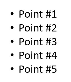
Basic bullet points
On the HOME tab, look at the PARAGRAPH group and you’ll find the option CONVERT TO SMARTART.

Convert to SmartArt
Click on that to open a selection of SmartArt graphics.

Initial list of SmartArt
If you don’t like any of those shown, click on MORE SMARTART GRAPHICS and choose from the whole list of available designs which are arranged by category.

Full categorised SmartArt list
Click on your preferred graphic and PowerPoint does the rest.

Converted bullets
Use the formatting tools to customise the appearance and if you want to, you can add some simple animation (nothing too distracting!) to show your “bullets” one at a time rather than all in one go. Remember, if there is text on a slide your audience will read it, and not only that, they will read it far quicker than you will present it, so anything you say about your slide is of no interest as everyone knows what’s coming up.
Speech Bubbles
A simple alternative might be speech bubbles or similar shapes that contain a word or two. Again…only use key words not paragraphs!

Thought/speech bubbles
In the example above, it does mean having more slides to show my three points but that’s not an issue. Remember, you don’t want people staring at the same slide for too long, and by that, I mean no more than a minute or two. If the slide becomes a distraction turn the screen black (press the B key) and just talk to your audience.
Notice that I have changed the eye position in each slide to look towards the thought bubble (done with Photoshop). It might seem like a minor point but as viewers, if we see a face, we are automatically drawn to it and then we automatically follow the direction of the eyes. So, if the eyes are looking in the wrong direction away from the object you’re trying to get people to look at, it causes a subconscious meltdown.
So, there you have two alternative ways of showing bullet points. There are of course many other ways of doing this, using custom graphics etc. but these two are readily available in PowerPoint and easy to create.
There is however, a caveat to all of this. When putting together a presentation there needs to be a common theme or design running throughout so that the audience knows that all the points you are making are somehow connected. The temptation to pick random images and graphics to simply avoid bullet points won’t be as effective as a set of slides using a common theme or design.
Putting together visually impactful and meaningful presentations takes lots of thinking, planning and preparation.
This last point is probably what pushes people towards creating bullet lists – they are quick and easy to put together, requiring little thought or planning. Unfortunately, that translates into uninteresting and unmemorable slides. A short list is sometimes the way to go…just don’t turn your entire presentation into one massive list!
")
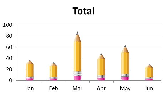
Excel/PowerPoint – Distortion Free Image Column Fill (Infographic style)
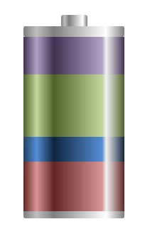
In an earlier blog, I showed you how to covert a standard stacked column chart into something that looked more like a battery infographic, to create a more visually interesting slide. This time I’ll show you how you can replace columns in a chart with an image but set it up so that you don’t get image distortion which is created by images being stretched or compressed by the different values in your table.
Let’s start with the basic chart.
Default Excel issue chart
As with all charts….it’s done its job but that is where it ends.
You can then format the chart to contain an image going through the normal FORMAT DATA SERIES > FILL > PICTURE OR TEXTURE FILL and select an image from your computer. Unfortunately, although it “works”, the image becomes distorted – higher values stretch the image and smaller values compress it, giving you this;
You could argue it doesn’t make much difference, but people will invariably read more into the image than is necessary – “oooh….I wonder what a blunt tip means?”, “does the size of the rubber tell us anything?”
So you need to find a way of keeping the proportions.
To achieve this we need to create three separate images;
- Rubber tip
- Main body of the pencil
- Pencil tip
In case you are wondering, I used Photoshop to cut out the pencil and then split it into 3 sections. Not everyone has access to Photoshop, so you may need to use some more basic cropping tools. By using Photoshop I am able to control size and blank space around my cut-out shapes more easily.

Splitting out the pencil
It also means we need to split out the data. At the moment we have a single series – one value per month in our table.
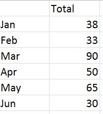
Original, basic data table
This now needs to be split into three to match the number of images we have. Let’s give a value of 10 to represent the tip and 10 to represent the rubber end. So our new data table now looks like this:
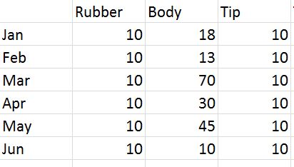
Modified data table
Now re-create the table, but this time use a STACKED COLUMN chart. You should now get this:

Stacked column chart
As before, you now need to format each series by inserting the appropriate image into each series i.e. image of the tip in the top series, the main body of the pencil in the middle series and finally the rubber tip into the bottom series. Once complete you will get an undistorted image in your columns, with each tip and rubber end the same size.
Take away lines and axes, add some values above the pencils and you end up with what appears to be an infographic of some sort, ideal for a PowerPoint presentation: a nice clean image free of clutter and unnecessary detail which hopefully will be a bit more memorable than the default offering in Excel.

Final chart/infographic
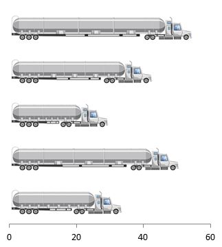
Here is another example using exactly the same principles but applied to a bar chart;
PowerPoint – Make a Chart Look like an Infographic
Far too often, people will add charts to their presentations without even attempting to make them vaguely interesting or memorable. At the end of the day, data is data and is not necessarily the most interesting thing on earth, but there is no need to bore people to death showing an endless procession of slides made up of bullets and standard charts.
Infographics are one way to make your slides more interesting and hopefully more memorable. You’ll see all sorts of infographics in the press and on the web, but many of these are created by graphic designers using specialist software which most of us will not have access to.
However, you can use in-built formatting options, and drawing tools within PowerPoint to create infographic-type shapes and images. In earlier blogs, I showed you how to create shiny spheres and transparent cylinders using only the tools and options you find in PowerPoint.
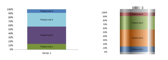
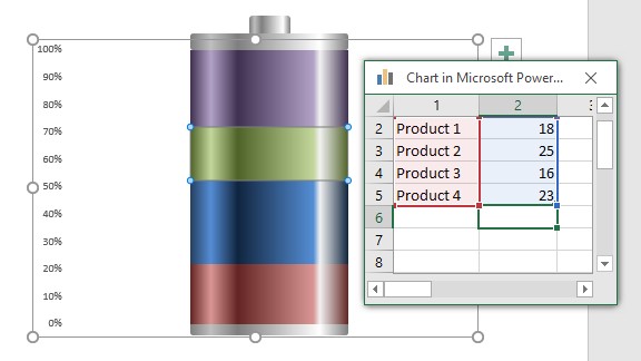
At the top of the page, you have a standard 100% chart and next to it is the same chart but with three added shapes and some formatting to make it look like a battery. Hopefully, people will remember the battery and what parts of the business give it a “full charge” compared to the rather dull standard Excel chart.
Working directly in PowerPoint, insert a chart into a slide.

Select 100% STACKED COLUMN chart type.

Click on OK.
Edit the data in the worksheet that opens.

You may need to SWITCH ROW/COLUMN to get the values stacked up properly, but once done you will get the standard Excel chart with whatever colours it selects for you by default.

It’s done its job. you could add some labels but it’s hardly memorable.
So let’s convert it into something more akin to an infographic.
First of all, get rid of anything you won’t need in the final “image” i.e. x-axis, grid lines etc. You can always remove or add elements depending on the final look you want to create.
Now to add the shiny effect to the chart to make it look like it might be a cylinder and has some depth to it:Click on one of the segments in the chart to select it.
If you are using Excel 2010 or earlier you will find a number of “interesting” preset gradients. Some of these are actually quite good for what we want to do.
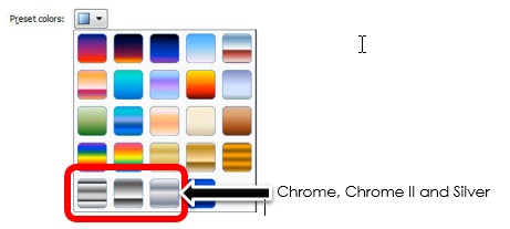
If you are using 2013 or later then these preset options have disappeared and become a selection of standard colours which admittedly are less gaudy but you will have more work to do to get the final desired effect.

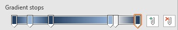
Whichever version you have, you will need to adjust the GRADIENT STOPS, adding light and shade sections to the chart segment. If you need to add GRADIENT STOPS just click on plus button next to the GRADIENTS STOPS . Move the marker to the appropriate position and then select a colour. This is entirely down to personal choice but for reference these are the settings I chose to achieve the look in this blog (use whichever colour you want to set up your marker positions);
- Stop 1: 0%, blue-gray, Accent 1, darker 50%
- Stop 2: 13%, light blue, Accent 1, lighter 40%
- Stop 3: 30%, blue-gray, Accent 1, darker 50%
- Stop 4: 78%, light blue, Accent 1, lighter 40%
- Stop 5: 82%, white, background 1, darker 5%
- Stop 6: 100%, blue-gray, Accent 1, darker 50%
Apply the same gradient settings to each segment picking a different colour each time. This is not as bad as it sounds. When you select GRADIENT for each segment the settings you applied are still there. All you will have to do is change the colours.
Once complete, you should have something like this;
All you need to do now is add some shapes top and bottom of the chart to create the battery effect.
Using the standard shapes, use the RECTANGLE: ROUNDED CORNERS and create two blocks to represent the top and bottom of the battery, and then a smaller third block to represent the positive or cathode end of the battery. Line them up and send them to the back so they don’t hide any of the chart. Apply the same gradient to each rectangle….and done.
There you have an editable chart that looks like a battery!
To edit your data, right click on the battery and select EDIT DATA.

Change your numbers (better still…get the data to update itself) and close the workbook to see your new updated chart/battery.
Excel – Create a Custom Matrix Background
If you have ever been on any sort of management course, you will have been shown a variety of matrixes to represent data, strategy etc. These can be quite visual and can help to identify products or people who fit into different areas allowing you to target specific areas rather than try and tackle everything. Most of the time, you will see these in PowerPoint or Word, and have been manually created and are not particularly accurate and are not dynamic in any way.
So how can we create a useful matrix on which we can plot data?
First of all we have to decide on the type of chart that will best display our raw data. In the case of matrix displays a scatter chart is best, plotting results based on two set of values, effectively giving us x and y co-ordinates.
Using recent enquiries I have had, some examples of this might be:
- strategic importance of work compared to the revenue it will generate
- knowledge transfer from long serving staff due to retire – level of critical knowledge vs. the amount of time before retirement
In both of these examples, the business wants to identify work or people that might have a critical impact on the business so that they can be prioritised ahead of less critical work or where very specific and unique knowledge sits with one person, and ensure that an individual’s knowledge is recorded or transferred before they leave.
Let’s take the critical knowledge transfer and create a chart to track that.
One piece of information I will need is the amount of time between today and the day the person is scheduled to retire, and I might break that down into three segments;
- less than 3 months
- 3-6 months
- 6 months to one year
The other piece of information I will need is the level of knowledge an individual might have and assign scores or levels (these are likely to be subjective);
- Low
- Medium
- High
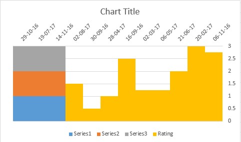
So we may find ourselves with data like this;

Basic starting data
Because we can’t plot “words” in a scatter chart I need to change the Low-Medium-High ratings to numerical values. Depending on how you measure this you can use a simple 1-2-3 or have something with a few more breakpoints – choice is yours.
So now our new table might look like this (I’ve used a basic data validation list for the rating);
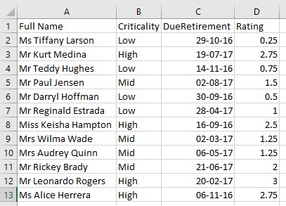
Data with added scores/rating values
We can now create a simple scatter chart using the due retirement and rating columns.
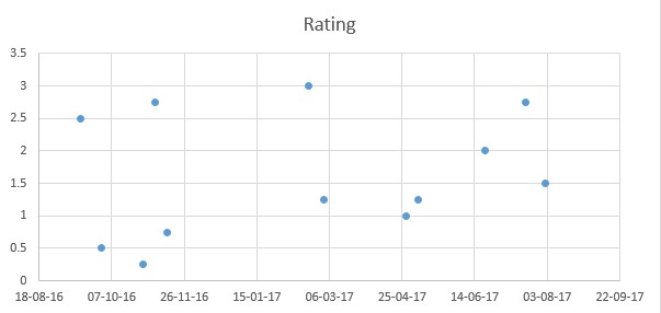
Standard scatter chart
The data has plotted OK but nothing jumps out at us to start dealing with those who will be shortly retiring and have critical knowledge level of high. What we need is some sort of background with clear segments to help identify target employees.
We could create or find an image that contains the number of segments we need but the proportions may not be that accurate, so the image will have to be stretched or simply won’t fit in with our data. So we are going to create the background manually using dummy data.
As we have three levels of criticality and 3 time periods we will need a 3 x 3 grid pattern.
Away from your real data, type the following values;

Dummy data to create bandings
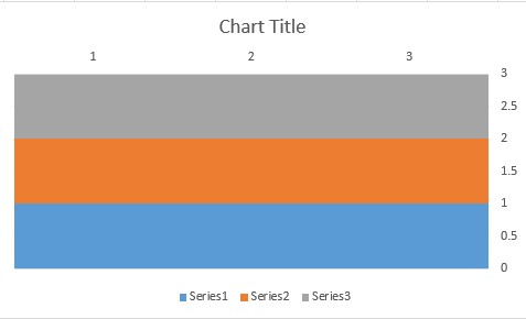
Using these values create a stacked column chart…

Base chart
…and get what you see above. At this point we need to do a few minor adjustments;
- Fix the maximum value of the Y-axis to 3
- Set the gap between series to no gap or 0%

Change axis maximum value

Change settings on the chart – gap width
Our chart will now look like this;

Before we start applying different colours to the various segments that make up the chart, we have to move the axes out of the way. The axes need to be moved because we need to copy the “real” data onto the chart, and in order for the data points to look as they did in the first basic chart (with no background) we need to use secondary x and y axes. If this is not done, the real data looks back to front and upside down as you need to read the values off the secondary axes rather than off the normal x and y axes. It’s not a major issue but best to sort out at this stage.
Right click on either axis. If you select the x axis first then select the axis option VERTICAL AXIS CROSSES AT MAXIMUM CATEGORY.
Right click on the y axis and from the options select HORIZONTAL AXIS CROSSES AT MAXIMUM AXIS VALUE.
The chart should now look like this;
Apply formatting of some sort to your segments. Use any of the fill options available to you at this stage – solid colours, gradients, images or patterns…more options than you can shake a stick at.
The path is now clear to add the real data to the chart.
Highlight the due retirement and rating columns as we did in the original plain scatter chart and copy them.
Depending on how much data you have, you can create a separate column using a formula to only identify people who have a leave date within the next year…no need to plot people who are not going for another 10 years!
Click on the chart that is being used to represent the 3 x 3 grid of our matrix. On the HOME tab click on the arrow below PASTE and select PASTE SPECIAL. Instead of the normal options you see if you do this (paste values, paste link etc.) you will see this dialog box;

Paste special window for chart data
Select all the options as in the picture above and click on OK. The chart that appears looks very odd as it is trying to plot your copied data as stacked columns – the same chart type as the base chart with our grid.
Our chart with the added “real” data
If you’re using 2010 right click on the new series you just added and select CHANGE SERIES CHART TYPE, and select SCATTER WITH ONLY MARKERS type chart. If you’re using 2013 or later then it will open the COMBO chart dialog window. Select the correct series and select SCATTER.

Set the correct combination charts

New series changed over to the correct scatter type plot
Now, it’s purely down to formatting. Depending on what you are presenting and how you want to highlight data points will be entirely up to you. In my version here, you will see I have added shading to differentiate between the high/mid/low ratings and some extra labels to identify the criticality levels, as well as some arrows to highlight the timescale – the latter having been added manually.

Completed chart with custom gradients and additional labels/arrows
The only other thing I have added are some custom labels. As we are working with a scatter chart we can’t attach any useful labels to the data points. I have added a new column with a formula to pick out the names of people who have a criticality level of high and their leave date is within the next three months. I then used Rob Bovey’s xy chart labeller which is a free add-in that is perfect for this sort of job. If you are not familiar with this add-in, read my blog http://wp.me/p2EAVc-et which explains how it works and where you can get it from – an absolute must for these sorts of jobs.
So that’s one way of creating a custom background to make a matrix type display using Excel. Once you have your basic set up for the background, i.e. number of segments you want to measure against, it’s down to your raw data. Depending on your own Excel skills, use data validation, dynamic ranges, formulas etc. and whether you are working with static or continuously evolving data, how much interaction and dynamism you want to build into your matrix. With a little thought and preparation you can construct a pretty useful matrix type chart that will highlight data points, be they people or activities that need attention.
One Note – The forgotten tool in the Office suite
If you’re already using One Note then you will know how useful it can be and also how easy it is use. If you are amongst the majority who have never used it or as is often the case, not even noticed it is installed on your laptop or PC, then read on…
As the name suggests it’s a notebook, but it offers a lot more than just somewhere to jot down the odd comment or two.
One Note allows you to organise data, notes, web links, images etc. into sections, with each section containing pages. Each page is quite literally a blank canvas where you can add notes etc. anywhere you like. So unlike Word which is fixed, in other words, you start writing at the top of the page unless you press enter 10 times to start further down the page, you can start typing anywhere on the page, just like a paper notebook, with the advantage of being able to move or copy notes anywhere within the page, notebook or even to another notebook.
Let’s look at the structure of a notebook;
- First of all you can have multiple notebooks.
- Each notebook can be divided into multiple sections.
- Each section is made up of pages and sub-pages.
There is a great diagram showing how a notebook is structured within One Note itself which you can see below.
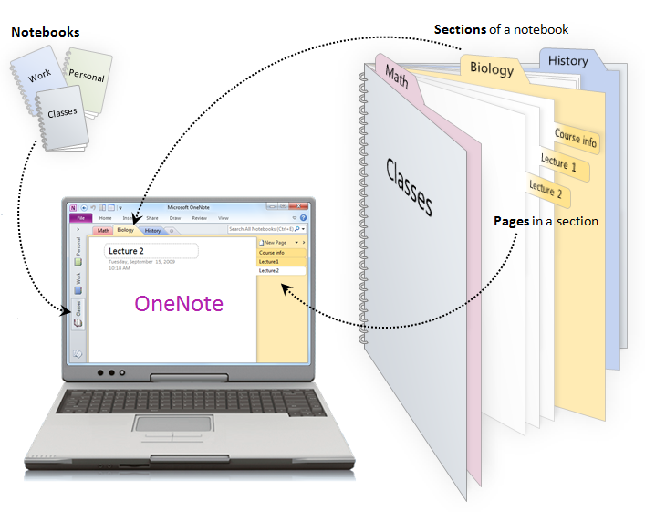
Notebook structure
To create a new notebook go to FILE, NEW and set where the notebook will be created (web, network or My Computer), give it a name and click on CREATE NOTEBOOK.
To add new sections just click on the tab with a star on it or right click on an existing tab and select NEW SECTION. When the tab is created the name of the section is active. Type a name for your new section and press enter. You can rename a tab at any point by right clicking on the tab and selecting rename.
Section tabs
By default, a section has one page. Rather than click or anything else on the tab on the right hand side of the page, you type the page name or heading in the dotted box in the top left hand corner of the page. To add new pages, click on NEW PAGE above the page name tabs and use the same steps as above to name your new page.
Once you have your basic structure, it’s down to adding content.
You can add all sorts to your notebook;
- Text
- Tables
- Pictures
- Screen clippings (using the Snippet tool)
- Links
- Files (as attachments)
- Files (readable – whole printout)
- Scanned documents
- Voice memos
- Video memos
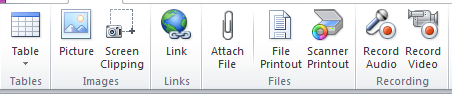
All the insert options in the Ribbon
Note there isn’t an insert text option – just start typing wherever your cursor is.
To help you flag content, you can add tags. You’ll find these on the HOME tab. You can easily create to do notes, highlight questions etc. You can add new ones and you can move tags that you use regularly to the top of the list so you can use a keyboard shortcut to add the tag. Once tags are in place you can search by tag name to find them quickly again.
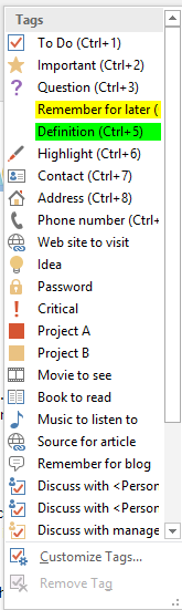
List of available tags
There is also a DRAW tab, which gives you a number of drawing tools. Pick from various pens, colours and thicknesses to create free hand drawings, as well as draw shapes and graphs. Obviously, this will work much better if you have either a touch enabled screen or a graphics tablet rather than trying to write or draw with a mouse which is pretty hopeless to say the least.

The Draw tab
So that’s pretty much everything you can add to a page from within One Note.
Also note that One Note automatically saves anything you do, so don’t go looking for the save button. You can do SAVE AS to save pages and sections etc. as new pages, new sections or even new notebooks.
Now…where One Note sits high above all the other applications is its level of accessibility across applications and devices.
Just look for the One Note buttons in most applications.
Outlook:

You receive a mail that relates to a project you are tracking in one of your notebooks and would like to have a copy of it along with your notes – just click on the One Note button and the open mail item will be copied. You will be prompted to select the notebook and page to send the mail to.
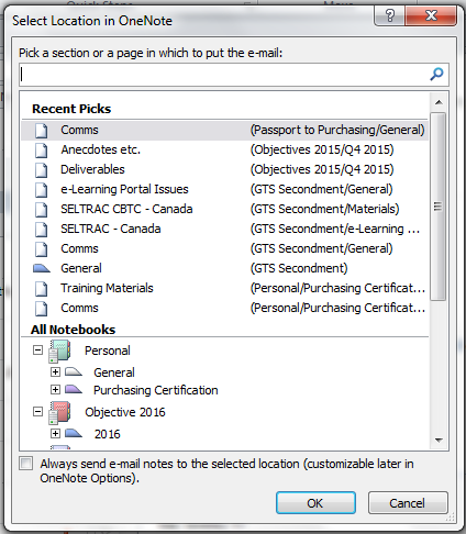
Pick where you want to save a note
The e-mail in its entirety will now be in your notebook and can be annotated etc. like any other note.
Alternatively you can e-mail pages directly from One Note. If you have minutes from a meeting, action points etc. in One Note just click on E-MAIL PAGE – no need to copy/paste the contents or re-write them.

Internet explorer:
In IE (bit not Firefox) you can create notes that are directly linked to a web page (One Note linked note), or even send the web page itself to One Note. As with e-mail you’ll be prompted to select a specific page in a notebook. Just right click on the web page and select whichever option you prefer.
PowerPoint:

From within PowerPoint you can add LINKED NOTES. As always, select a page to add the linked note to, start typing something and One Note will add a PowerPoint icon next to the note. Then, from within One Note you can click on the icon and it will open the presentation at the slide you created the linked note from.
Word:
Like PowerPoint, you can create notes that have links to documents created in Word. Look for the Word icon next to a note and click on it to open the document at the page relating to the linked note.
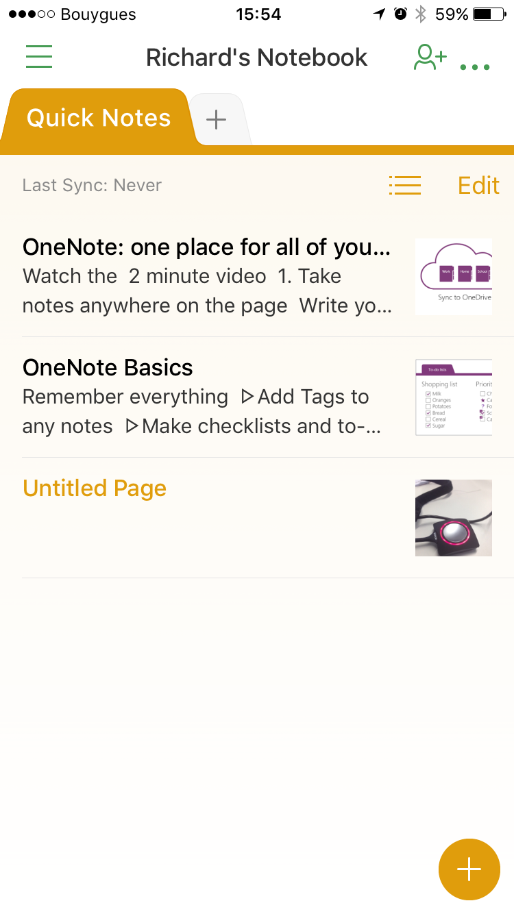
Mobile Devices:
You can download One Note to your mobile phone – for both Android and iOS. OK…it doesn’t have all the features of the desktop version but it’s great for quick notes, sending images etc. while you’re out an about. You can view all your notebooks and make edits through your phone.
Screenshot of One Note on an iPhone
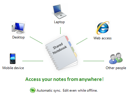
The final great feature of One Note is that you can access your notebooks from any laptop, PC where you are a user. You can even install One Note on both Android and Apple phones and link it back to your notebooks. The convenience of this is that you can be anywhere – see something interesting, or suddenly come up with an idea, you can make a note, record video or a voice memo and save it straight to One Note which is then automatically synchronised to all your other devices. Even if you don’t have access to any of your devices but can get on the internet, sign in to your Microsoft Live account and access your notebooks from any PC, laptop or tablet without the need to even install One Note. If you have shared notebooks then all of One Note’s features are available to all team members. Brilliant, and so convenient it’s untrue.
Cross device connectivity
For those of you in a work environment you may not be so lucky. Depending on network and access restrictions, you may find yourself limited to using One Note on your PC or laptop only, and unable to create shared notebooks, or link to mobile devices as it all depends on having a Live account which most businesses will not allow. If you can create networked notebooks, then this can be very useful if a team of you are working on a project. Each team member can update files, add comments etc. to the notebook, and any added comments have tags showing who added the comment, as well as the date and time it was added. This makes One Note a great collaborative tool, even if you are restricted to your network. If you have access to the full range of functionality including mobile apps then even better.
One Note has the potential to be a very powerful tool across multiple users especially for remote teams who need a simple and convenient way to keep in touch and share files, thoughts, images etc. quickly and easily. Even if you can’t use it to its full potential, simply using it as a private notebook is an excellent way to manage all your projects and all kinds of information in a variety of media types.
As a quick note, if you have Windows 10 installed, One Note is pre-installed, but this is only the app version not the desktop version. It works fine, but you don’t have all the functionality of the full version. You will need to download the desktop version direct from Microsoft.
So if you haven’t tried using One Note yet, take a look. Once you start using it you’ll find out just how easy it is to use and how useful it can be.
Excel – Dealing with Non-Printable Characters
Every so often you may encounter a problem with Excel where a function is not working properly, even though you know that your function syntax is correct. And when you manually check the data you find that the function is not returning the correct answer.
So what is going on?
This problem happened to me again recently and it took a little while for the penny to drop as it is fairly rare, but highly annoying when it does.
And it is down to something called “non-printable characters”. These pesky characters are invisible, which makes it doubly difficult to identify. These tend to crop up in reports that have been downloaded from other systems, which for reasons unknown, slip in characters of some sort that cannot be seen or identified on screen, but nevertheless cause mayhem with a number of functions.
As an example I’ll use the data which caused me the most recent problem.

Sample data causing the problem
The company I work for uses a web based database to manage courses and delegates and some information was extracted to generate a catalogue within a workbook (sample above). I wrote some VBA code to help users find courses either by name of ID number and in one instance, the dreaded end-debug screen kept on appearing.
The form I created allows users to enter partial names or IDs and search for information based on that partial string. When they entered the number 26, a message told them that two records had been found.

Message returned by the VBA code
This was done using a COUNTIF function. However, there were in fact 6 records that contained the number 26.

…but autofilter finds more records
So on the one hand the COUNTIF function was finding 2 records, but the loop in the code which populated an array in the memory was crashing as it found a third record that contained the number 26. The dynamic array was not big enough as the size was recalculated based on the findings of the COUNTIF function.
Initially I looked at formats – text vs. numbers for example.
I also looked for any spaces that might have caused an issue.
I manually added a COUNTIF function in the worksheet to double-check the findings of the function created in VBA but this gave the answer 2 as well.
=COUNTIF(C:C,”*26*”)
Finally, realising that this was an extract from a non-Excel source, I tried using the CLEAN function suspecting that there may be some non-printable characters in there somewhere. The CLEAN function removes all non-printable characters from text. The syntax is very simple:
=CLEAN(cell reference)
In a new column I wrote this formula and then copied all the “cleaned” text values and used PASTE SPECIAL VALUES over the original cells and retested the COUNTIF function.
…and hey presto…it found all 6 records.
So next time your functions are not working and seem incapable of identifying values in cells, try applying the CLEAN function to your data, it might just be the solution to your problem.
Excel – Using Report Filters in Pivot Tables
In a previous blog I showed you how to create a basic Pivot table. We looked at how to add fields to columns, rows and values areas to quickly summarise information from a list of data.
One part of the grid I did not cover last time was the FILTERS segment. This works in exactly the same way as the other segments we use to build our Pivot table, i.e. click and drag field names into it.
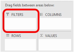
The FILTERS area
As the name suggests, fields dragged into this area can be used as a filter. These can be very useful to keep your Pivot tables relatively simple and can help to reduce the overall size of the Pivot table.
Using some basic data, I will build up a Pivot table, but first without applying a FILTER field.
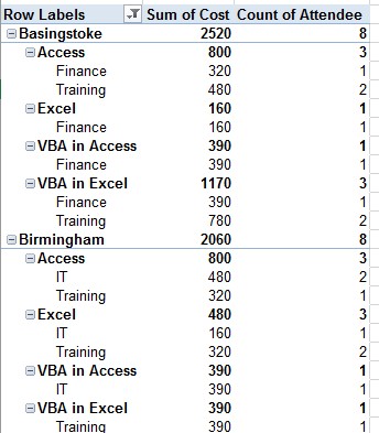
Pivot with no FILTERS applied
This produced a Pivot table 118 lines long, including totals and subtotals. It’s OK, it does its job, but perhaps we can improve it or at least simplify it a bit.
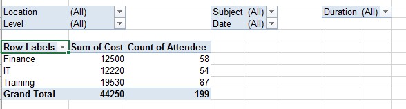
By moving the location and subject fields into the FILTERS area, we then get this;
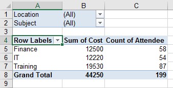
Same Pivot with FILTERS added
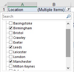
We may have lost some of detail that was visible before but the table is now only 8 rows long. No more incessant scrolling up and down to see results. Now…to see the detail, I can be very specific in what I see by clicking on the drop downs next to my FILTER fields.
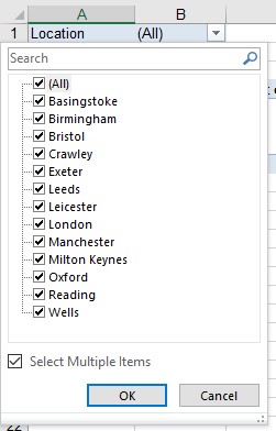
Location filter items
I can now see and select any one or more of the locations that appear in my location field. Note that I have ticked the SELECT MULTIPLE ITEMS option at the bottom of the list in order to be able to pick more than one location. If I don’t tick it, then I can only pick one location at a time. Personally, I would always tick this option whether I am picking one or several items.
Once you’ve made your choice, click on OK.
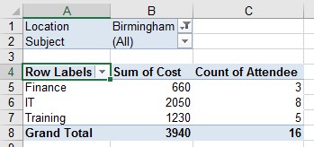
Single item selected
Here, I have picked just one location (Birmingham) and below I have chosen three;
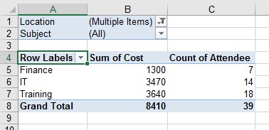
Multiple items selected
Note that when multiple items are selected that’s all it tells you in the drop down – MULTIPLE ITEMS. If you need reminding of which ones you picked just click on the drop down again.
Checking when multiple items selected
Also note that with each FILTER applied the size of my Pivot table remains unchanged. This won’t be the case every time, but at least you shouldn’t end up with the table being 10 rows and then jumping to 150 rows with the next filter, but this will be entirely dependent on your data and how you structure your base Pivot table.
If you are going to apply lots of filters, you can control how these are laid out above your Pivot table. If I keep on adding more and more FILTERS I get this;
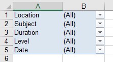
Five filter fields added
There’s nothing really wrong with this, but if you prefer you can distribute the filters over several columns and rows which might suit you better.
To customise this, click in your Pivot table and then go to the OPTIONS or ANALYZE tab (depending on which version of Excel you have) in the PIVOTTABLE TOOLS tabs and click on OPTIONS.
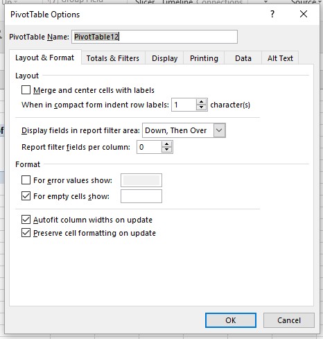
Pivot table options window
In the OPTIONS window, select the LAYOUT & FORMAT tab. Here, there are two settings you can use;
- Display fields in report filter area
- Report filter fields per row
The first option determines whether it fills rows before moving across to the next column (DOWN, THEN OVER) or fill across the columns first, then move to the next row (OVER, THEN DOWN).
Use the second option to set the number of fields you want to see per row. So going back to our earlier example, with five FILTERS, if I set the options to OVER, THEN DOWN using three fields per row we get this;
Customised filters layout
As with any settings, there is no right or wrong, only what suits you and the number of FILTERS you want to create.
As a word of advice, rather than anything else, try to stick to top level fields to have in your FILTERS. Although I have put date in the example above, this is generally not a good field to use in FILTERS as it is too granular. I used to manage inventory across a number of warehouses across Europe, and good top level FILTERS were things like product line, warehouse number, consumable/non-consumable flags, rather than part number. It meant I could quickly narrow down my output to consumable items for a specific product line, in a specific warehouse. As with everything, the choice is yours.
So, other than enable you to filter your Pivot table results, what else can you do with FILTERS?
Lurking under the OPTIONS button, is something called SHOW REPORT FILTER PAGES.
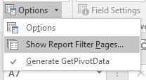
Show report filter pages option
To get to this, make sure you click on the arrow next to OPTIONS rather than on the OPTIONS button itself. Note that this option is greyed out if no fields are present in the FILTERS area.
You should then see a window with a list of any FILTERS you have in place.
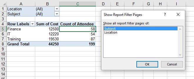
List of filters in the current Pivot table
(I’ve reverted back to the original Pivot table I created….simpler to view)
Pick any one of the FILTERS shown and click on OK.
Then check out the new tabs that appear in your workbook!
New tabs in the workbook
What this does is create a separate worksheet for each item in the selected filter. In this example, it has created a separate sheet for each course. Had I selected location, then a separate sheet would have been created for each location.
Each sheet contains a Pivot table in its own right. But why do this, create a whole load of new sheets when the information is already nicely packaged in a single Pivot table? Let me ask you this…are the people you send your Pivot tables to happy using Pivots and do they know what they are doing when using drop downs etc. within those Pivots? Probably not. By sending the information like this, all your users have to do, is go to the tab that interests them and view it. No need to apply filters, or click on anything that is likely to cause panic or confusion. This may seem like a damning indictment of the average Excel user, but you don’t know what you don’t know, and if Pivots are a mystery, it’s easy to click or even worse, double click on something and a new sheet appearing or alter the structure of the Pivot with the user not knowing why something happened or how to correct it.
So that’s FILTERS for you. Useful to quickly narrow down output in a Pivot and also making Pivot data more accessible to non-Pivot users.
