Blog Archives
PowerPoint – Make a Chart Look like an Infographic
Far too often, people will add charts to their presentations without even attempting to make them vaguely interesting or memorable. At the end of the day, data is data and is not necessarily the most interesting thing on earth, but there is no need to bore people to death showing an endless procession of slides made up of bullets and standard charts.
Infographics are one way to make your slides more interesting and hopefully more memorable. You’ll see all sorts of infographics in the press and on the web, but many of these are created by graphic designers using specialist software which most of us will not have access to.
However, you can use in-built formatting options, and drawing tools within PowerPoint to create infographic-type shapes and images. In earlier blogs, I showed you how to create shiny spheres and transparent cylinders using only the tools and options you find in PowerPoint.
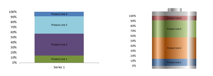
At the top of the page, you have a standard 100% chart and next to it is the same chart but with three added shapes and some formatting to make it look like a battery. Hopefully, people will remember the battery and what parts of the business give it a “full charge” compared to the rather dull standard Excel chart.
Working directly in PowerPoint, insert a chart into a slide.

Select 100% STACKED COLUMN chart type.

Click on OK.
Edit the data in the worksheet that opens.

You may need to SWITCH ROW/COLUMN to get the values stacked up properly, but once done you will get the standard Excel chart with whatever colours it selects for you by default.

It’s done its job. you could add some labels but it’s hardly memorable.
So let’s convert it into something more akin to an infographic.
First of all, get rid of anything you won’t need in the final “image” i.e. x-axis, grid lines etc. You can always remove or add elements depending on the final look you want to create.
Now to add the shiny effect to the chart to make it look like it might be a cylinder and has some depth to it:Click on one of the segments in the chart to select it.
If you are using Excel 2010 or earlier you will find a number of “interesting” preset gradients. Some of these are actually quite good for what we want to do.
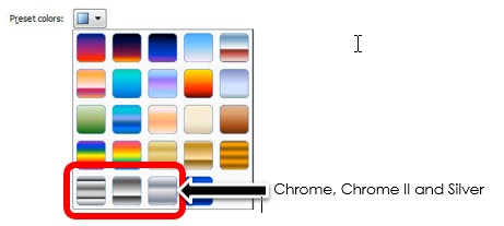
If you are using 2013 or later then these preset options have disappeared and become a selection of standard colours which admittedly are less gaudy but you will have more work to do to get the final desired effect.

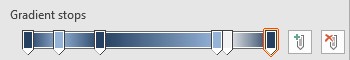
Whichever version you have, you will need to adjust the GRADIENT STOPS, adding light and shade sections to the chart segment. If you need to add GRADIENT STOPS just click on plus button next to the GRADIENTS STOPS . Move the marker to the appropriate position and then select a colour. This is entirely down to personal choice but for reference these are the settings I chose to achieve the look in this blog (use whichever colour you want to set up your marker positions);
- Stop 1: 0%, blue-gray, Accent 1, darker 50%
- Stop 2: 13%, light blue, Accent 1, lighter 40%
- Stop 3: 30%, blue-gray, Accent 1, darker 50%
- Stop 4: 78%, light blue, Accent 1, lighter 40%
- Stop 5: 82%, white, background 1, darker 5%
- Stop 6: 100%, blue-gray, Accent 1, darker 50%
Apply the same gradient settings to each segment picking a different colour each time. This is not as bad as it sounds. When you select GRADIENT for each segment the settings you applied are still there. All you will have to do is change the colours.
Once complete, you should have something like this;
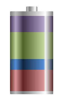
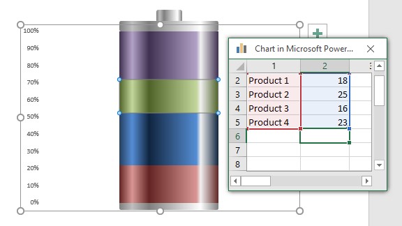
All you need to do now is add some shapes top and bottom of the chart to create the battery effect.
Using the standard shapes, use the RECTANGLE: ROUNDED CORNERS and create two blocks to represent the top and bottom of the battery, and then a smaller third block to represent the positive or cathode end of the battery. Line them up and send them to the back so they don’t hide any of the chart. Apply the same gradient to each rectangle….and done.
There you have an editable chart that looks like a battery!
To edit your data, right click on the battery and select EDIT DATA.

Change your numbers (better still…get the data to update itself) and close the workbook to see your new updated chart/battery.