Category Archives: PowerPoint
PowerPoint – Alternatives to Bullet Points
Bullet points in presentations have a very bad reputation, not because they are necessarily bad things, but because they are over-used and misused. Seth Godin (marketing/presentation guru) describes bullets as aggressive, and usually represent a disorderly random list that is easily forgettable. Garr Reynolds (author of Presentation Zen) argues that text laden bullets are actually a barrier to good communication. Even psychologists have studied the effect of bullet points and Chris Atherton (cognitive psychologist) concluded that “bullets don’t kill, bullet points do”.
So, all in all, a pretty damning indictment of bullet points.
Unfortunately, the dominance of the text heavy bullet point slide still exists in the workplace today. It is still far too commonplace to see presentations made up almost entirely of bullet points.
I mean…does this look in any way interesting?

Bullet point hell!
Yawn! You wouldn’t want to sit through that, so why inflict it on others?
Now we know that bullet points are the devil incarnate, what are the alternatives?
The best solution that all the leading presentation experts point to, is use a picture. It may be a cliché to say a picture paints a thousand words…but it does. Images, if chosen carefully will elicit an emotion from the audience which they will remember more easily and far longer than they will a list of words.
Assuming you work for a slightly more conservative/traditional organisation which expects to see bullet points and the whole screen image thing is a step too far, then try to get a bit more creative in how you present your bullets.
Use SmartArt
SmartArt graphics are ready-made and editable graphics that can convert the humble list into something a bit more interesting. As with bullet points themselves, don’t over use SmartArt and definitely don’t use the same one for every slide.
If you have bullet points, and you have managed to reduce the text down to key words, you can convert your bullet points into a SmartArt graphic very easily.
Here we have some very basic bullets;

Basic bullet points
On the HOME tab, look at the PARAGRAPH group and you’ll find the option CONVERT TO SMARTART.

Convert to SmartArt
Click on that to open a selection of SmartArt graphics.

Initial list of SmartArt
If you don’t like any of those shown, click on MORE SMARTART GRAPHICS and choose from the whole list of available designs which are arranged by category.

Full categorised SmartArt list
Click on your preferred graphic and PowerPoint does the rest.

Converted bullets
Use the formatting tools to customise the appearance and if you want to, you can add some simple animation (nothing too distracting!) to show your “bullets” one at a time rather than all in one go. Remember, if there is text on a slide your audience will read it, and not only that, they will read it far quicker than you will present it, so anything you say about your slide is of no interest as everyone knows what’s coming up.
Speech Bubbles
A simple alternative might be speech bubbles or similar shapes that contain a word or two. Again…only use key words not paragraphs!

Thought/speech bubbles
In the example above, it does mean having more slides to show my three points but that’s not an issue. Remember, you don’t want people staring at the same slide for too long, and by that, I mean no more than a minute or two. If the slide becomes a distraction turn the screen black (press the B key) and just talk to your audience.
Notice that I have changed the eye position in each slide to look towards the thought bubble (done with Photoshop). It might seem like a minor point but as viewers, if we see a face, we are automatically drawn to it and then we automatically follow the direction of the eyes. So, if the eyes are looking in the wrong direction away from the object you’re trying to get people to look at, it causes a subconscious meltdown.
So, there you have two alternative ways of showing bullet points. There are of course many other ways of doing this, using custom graphics etc. but these two are readily available in PowerPoint and easy to create.
There is however, a caveat to all of this. When putting together a presentation there needs to be a common theme or design running throughout so that the audience knows that all the points you are making are somehow connected. The temptation to pick random images and graphics to simply avoid bullet points won’t be as effective as a set of slides using a common theme or design.
Putting together visually impactful and meaningful presentations takes lots of thinking, planning and preparation.
This last point is probably what pushes people towards creating bullet lists – they are quick and easy to put together, requiring little thought or planning. Unfortunately, that translates into uninteresting and unmemorable slides. A short list is sometimes the way to go…just don’t turn your entire presentation into one massive list!
")
Excel/PowerPoint – Distortion Free Image Column Fill (Infographic style)
In an earlier blog, I showed you how to covert a standard stacked column chart into something that looked more like a battery infographic, to create a more visually interesting slide. This time I’ll show you how you can replace columns in a chart with an image but set it up so that you don’t get image distortion which is created by images being stretched or compressed by the different values in your table.
Let’s start with the basic chart.

Default Excel issue chart
As with all charts….it’s done its job but that is where it ends.
You can then format the chart to contain an image going through the normal FORMAT DATA SERIES > FILL > PICTURE OR TEXTURE FILL and select an image from your computer. Unfortunately, although it “works”, the image becomes distorted – higher values stretch the image and smaller values compress it, giving you this;

You could argue it doesn’t make much difference, but people will invariably read more into the image than is necessary – “oooh….I wonder what a blunt tip means?”, “does the size of the rubber tell us anything?”
So you need to find a way of keeping the proportions.
To achieve this we need to create three separate images;
- Rubber tip
- Main body of the pencil
- Pencil tip
In case you are wondering, I used Photoshop to cut out the pencil and then split it into 3 sections. Not everyone has access to Photoshop, so you may need to use some more basic cropping tools. By using Photoshop I am able to control size and blank space around my cut-out shapes more easily.

Splitting out the pencil
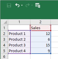
It also means we need to split out the data. At the moment we have a single series – one value per month in our table.
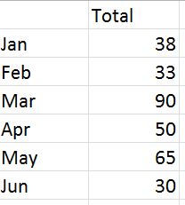
Original, basic data table
This now needs to be split into three to match the number of images we have. Let’s give a value of 10 to represent the tip and 10 to represent the rubber end. So our new data table now looks like this:

Modified data table
Now re-create the table, but this time use a STACKED COLUMN chart. You should now get this:

Stacked column chart
As before, you now need to format each series by inserting the appropriate image into each series i.e. image of the tip in the top series, the main body of the pencil in the middle series and finally the rubber tip into the bottom series. Once complete you will get an undistorted image in your columns, with each tip and rubber end the same size.
Take away lines and axes, add some values above the pencils and you end up with what appears to be an infographic of some sort, ideal for a PowerPoint presentation: a nice clean image free of clutter and unnecessary detail which hopefully will be a bit more memorable than the default offering in Excel.

Final chart/infographic
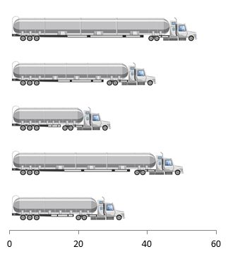
Here is another example using exactly the same principles but applied to a bar chart;
PowerPoint – Make a Chart Look like an Infographic
Far too often, people will add charts to their presentations without even attempting to make them vaguely interesting or memorable. At the end of the day, data is data and is not necessarily the most interesting thing on earth, but there is no need to bore people to death showing an endless procession of slides made up of bullets and standard charts.
Infographics are one way to make your slides more interesting and hopefully more memorable. You’ll see all sorts of infographics in the press and on the web, but many of these are created by graphic designers using specialist software which most of us will not have access to.
However, you can use in-built formatting options, and drawing tools within PowerPoint to create infographic-type shapes and images. In earlier blogs, I showed you how to create shiny spheres and transparent cylinders using only the tools and options you find in PowerPoint.
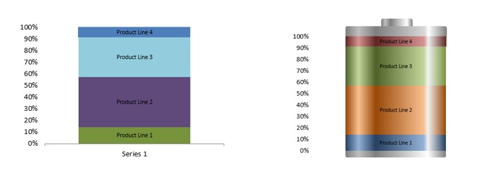
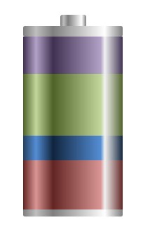
At the top of the page, you have a standard 100% chart and next to it is the same chart but with three added shapes and some formatting to make it look like a battery. Hopefully, people will remember the battery and what parts of the business give it a “full charge” compared to the rather dull standard Excel chart.
Working directly in PowerPoint, insert a chart into a slide.
Select 100% STACKED COLUMN chart type.
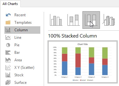
Click on OK.
Edit the data in the worksheet that opens.
You may need to SWITCH ROW/COLUMN to get the values stacked up properly, but once done you will get the standard Excel chart with whatever colours it selects for you by default.

It’s done its job. you could add some labels but it’s hardly memorable.
So let’s convert it into something more akin to an infographic.
First of all, get rid of anything you won’t need in the final “image” i.e. x-axis, grid lines etc. You can always remove or add elements depending on the final look you want to create.
Now to add the shiny effect to the chart to make it look like it might be a cylinder and has some depth to it:Click on one of the segments in the chart to select it.
If you are using Excel 2010 or earlier you will find a number of “interesting” preset gradients. Some of these are actually quite good for what we want to do.

If you are using 2013 or later then these preset options have disappeared and become a selection of standard colours which admittedly are less gaudy but you will have more work to do to get the final desired effect.
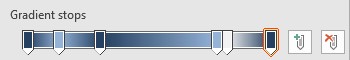
Whichever version you have, you will need to adjust the GRADIENT STOPS, adding light and shade sections to the chart segment. If you need to add GRADIENT STOPS just click on plus button next to the GRADIENTS STOPS . Move the marker to the appropriate position and then select a colour. This is entirely down to personal choice but for reference these are the settings I chose to achieve the look in this blog (use whichever colour you want to set up your marker positions);
- Stop 1: 0%, blue-gray, Accent 1, darker 50%
- Stop 2: 13%, light blue, Accent 1, lighter 40%
- Stop 3: 30%, blue-gray, Accent 1, darker 50%
- Stop 4: 78%, light blue, Accent 1, lighter 40%
- Stop 5: 82%, white, background 1, darker 5%
- Stop 6: 100%, blue-gray, Accent 1, darker 50%
Apply the same gradient settings to each segment picking a different colour each time. This is not as bad as it sounds. When you select GRADIENT for each segment the settings you applied are still there. All you will have to do is change the colours.
Once complete, you should have something like this;
All you need to do now is add some shapes top and bottom of the chart to create the battery effect.
Using the standard shapes, use the RECTANGLE: ROUNDED CORNERS and create two blocks to represent the top and bottom of the battery, and then a smaller third block to represent the positive or cathode end of the battery. Line them up and send them to the back so they don’t hide any of the chart. Apply the same gradient to each rectangle….and done.
There you have an editable chart that looks like a battery!
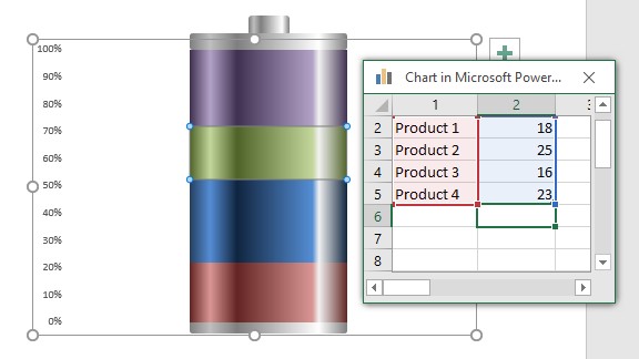
To edit your data, right click on the battery and select EDIT DATA.
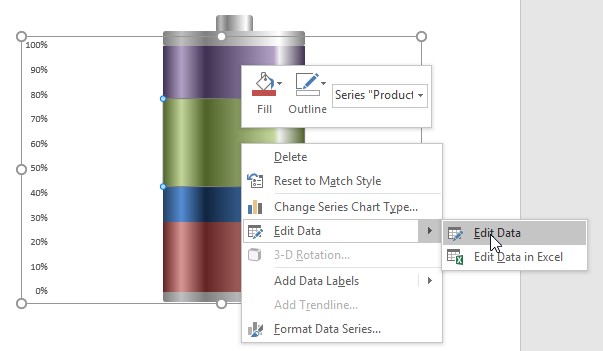
Change your numbers (better still…get the data to update itself) and close the workbook to see your new updated chart/battery.
PowerPoint – Working with Master Slides/Templates
Both screenshots below were taken from presentations with a .potx or template file extension. However, which one of these is a true PowerPoint template?

Tepmplate #1

Template #2
The correct answer is the second one (Template #2). How should you know this? Both files have the .potx file extension so surely they are both the same?
When you open a new PowerPoint what do you see? All you see is the TITLE SLIDE layout. This is a template. All blank presentations are based on a basic template…just like Word bases all new documents on a template with pre-set styles, fonts etc.
If you see anything more than this on screen…it’s not a real template!
If I had a pound for every time someone has asked me sort out their template which turned out to be a presentation with a .potx file extension I’d be a rich man. This is a very common mistake and stems from people not understanding how PowerPoint templates work, and for these to work you need to set up your MASTER SLIDES.
MASTER SLIDES are key to how your presentation looks and behaves, in terms of slide layouts, fonts, how bullet points (shudder!) work.
Let’s build a simple example…
Open a new BLANK presentation and go to the VIEW tab and click on SLIDE MASTER. You can now see the bare bones of the presentation and this is where you will do all your set up.

Open or view the Slide Master

Basic slide master view
Note that whatever slide layout you are in, you will be taken to that slide layout in the SLIDE MASTER.
So this is where the magic takes place. The golden rule here is don’t add any content!!! Many people make the mistake of creating their presentation here in the MASTER SLIDES – DON’T! This is where you set formats, font sizes and even custom layouts.
If you look at your SLIDE MASTER layouts down the left hand side of the screen you’ll notice one layout that is bigger than the rest.

The “Master Master” slide
For wont of a better name, I refer to this as the MASTER MASTER slide. Anything you add here such as logos, images etc. will appear in every layout. Use the normal tools to add images, and as soon as you add something you will see it appear in every slide layout below.

Background image copied down to all layouts
If you want something to ONLY appear in a specific layout then click on the layout and add whatever you need there. Whatever you add will only appear in that layout and not in any of the other layouts.

Individually customised title slide
Continue to customise each layout as necessary until all your slides have the required logos, images or designs.
At any point you can come out of the MASTER VIEW by clicking on CLOSE MASTER VIEW.

Close the Master Slide view
If you click on the layout button on the HOME tab you will now see the various layouts with your newly created design.

Layout options on the Home tab
Once the design work is complete then it’s time to set up fonts and bullet styles. Go back to your MASTER SLIDE view and click in one of the layouts.
Let’s assume that I want to set styles for all slides rather than adjust each one individually. Make sure the top slide in the MASTER VIEW is selected. Click on the title box and using the options on your HOME tab, set the font, size, colour etc. Note that as you set this title, all other titles on the other layouts are automatically updated to the new font style.

Title styles copied to all slides
If you intend using bullet points, click in the box below to set the MASTER TEXT STYLES.
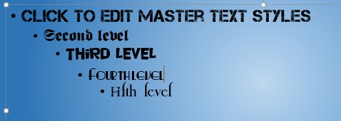
Font styles set
In this example I have set a different font at each bullet level. I would never do this in a real presentation, nor would I recommend it, but have done it here just to show what can be done. I can now also set the appearance of my bullets.

Bullet styles set
Again, this just to demonstrate what can be done rather than what you should do. If you take a look now at any of the other layouts you will see that the fonts and bullet styles have been changed throughout the presentation.

Formatting applied to one of the layouts from the Master Master slide
Remember that you can set each slide layout individually to have its own style, font size, colours, bullets and background images. Bear in mind that too many style changes etc. in any presentation are distracting and can make it look messy.
Once you have set everything up, save it as a template. When you reopen the presentation you will only see the main title slide and as you start typing the content, it will appear in the pre-set format you created in the template.

Using the template
You might be thinking, why go to all this trouble setting up fonts etc. in a template when I can do all this manually on the fly as I create my presentation? Well…the first thing is consistency. Every slide you create will have identical text, backgrounds etc. and you won’t have to think about the font size, colour or anything else for that matter which ultimately will save you a lot of time. All the points I have just mentioned are even more valid when applied to a business context where branding and consistency of branding are all important. Relying on users to apply the correct font, colour or images is very risky. So use a template…and make sure it is a REAL template and not a presentation masquerading as a template. Now go check out all your office “templates” and see if they are real or fake!
PowerPoint – 3-D Custom Shapes (Cylinders)
In a previous blog I showed you how to create a shiny sphere which you can use in a variety of ways. This time, I will show you how to create a transparent tube/cylinder.
Go to the INSERT tab and click on SHAPES. From the window that appears, click on the DONUT.

Pick out the donut
Draw a perfectly round DONUT by holding down the SHIFT key as you click and drag.

Resize the walls of your donut
The DONUT ring is quite thick and we need to reduce this a bit so we end up with the image on the right (above). To do this, click and drag the yellow grab handle towards the outside of the DONUT.
We will start with a basic cylinder for now, but I will show you how to add something inside the cylinder a bit further on.
Right click on your DONUT and select FORMAT SHAPE.
Select 3-D ROTATION, and from the presets, and from the group called PERSPECTIVE, pick the one called PERSPECTIVE RELAXED.

Perspective relaxed option
You now get something like this…

A “relaxed” donut
You can always change the perspective manually later to suit your particular requirements, but this will do for now.
At this stage we can add a little interest to the shape by adding a bevel, but it’s not absolutely necessary. If we do though, we do it by selecting the 3-D FORMAT option and selecting one of the bevel options from the TOP BEVEL button. This will give us…

“Relaxed” donut with added top bevel
Now we need to add some depth to our shape. Amongst the 3-D FORMAT options you’ll see DEPTH. Pick a colour so it matches with what will be the top of our cylinder and type in a value to give some depth to the DONUT. In this example I will set it to 250 pt.

Donut turned into a cylinder
Try out the different MATERIAL and LIGHTING options available to you as well as the ANGLE of the light to see a variety of different effects.

Using some of the material and lighting options
At this point you are thinking “well…that’s pretty…but what do I do with it?”
This is where having something in the cylinder might be of use. For instance you might want to represent profit levels, or levels of readiness for a project and want something a little more interesting than just 50% written across the screen.
Start off exactly as we did before to create the empty cylinder but this time add in a coloured CIRCLE inside the DONUT. Once you’ve done that, GROUP the two shapes together. Continue as above adding bevels and depth to the grouped shape. You should now have something like this…

Cylinder with “filling”
At the moment our contents “fill” the cylinder. We can adjust this level to whatever we want to give the impression of different values i.e. 75%, 50% etc.
Click TWICE (not a double click) to select the “filling”. Change the DEPTH to whatever level you want to show. Here, I will set it to 125 pt (or 50% of the full cylinder).

Filling adjusted to 50%
Problem is, the DEPTH varies starting from the top, not the bottom which would make more sense. To lower the “filling” go to 3-D ROTATION and go to the setting DISTANCE FROM GROUND. Enter a NEGATIVE value until you hit the bottom of the cylinder.
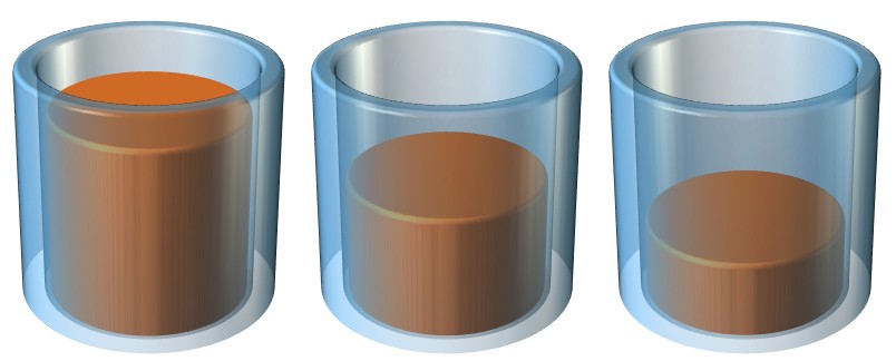
Three transparent cylinders showing three different fill levels
Apply different values to your “filling” to represent different values as I have done in the example above. I have also changed the perspective slightly to give a better view of the levels in each cylinder.
So with a few simple techniques you can create your own custom 3-D shapes that represent your data in a more visually interesting way than just a handful of bullets with numbers, and you don’t have to go and buy some random stock photo that doesn’t really show what you want the way you imagined it.
PowerPoint – Adding Animation to SmartArt Graphics
To animate or not…always a tricky one. The general feeling in a business environment is to not add any sort of animation. I have come across some customers whose house rules are so restrictive that most of the functionality within PowerPoint has been rendered redundant.
The problem with animation is that people can get easily carried away when adding animation to their slide and simply add animation because they can rather than use it purposefully. You may well see so much animation and varied transitions between slides that it actually detracts from the content of the presentation…or makes people feel ill because they feel more like they are on a rollercoaster as images go flying past their eyes!
So it’s probably safe to say that too much animation is not a good thing. But what is too much? Most presentations are made using bullet points…too many bullet points. This makes it boring and people tend to read on if all the bullets are shown on screen straight away. Bullets can now be easily replaced with SmartArt objects, and these can be animated to show one segment at a time. If you have not tried this before, this is how it is done;

Standard bullet points
Assuming you have a slide already set up with a number of bullet points, click on the text box to select it and go to CONVERT TO SMARTART on the HOME tab in the PARAGRAPH group.

SmartArt graphics options
Click on one of the SmartArt diagrams available or if nothing catches your eye, click on MORE SMARTART GRAPHICS to see the whole list of graphics split into various categories.

Bullets converted to SmartArt
Once you have chosen one you can use the edit panel to the left of the graphic to alter your text. Depending on the graphic selected you can type additional text in other areas such as the grey area in the example above. If you are not happy with
The chosen graphic pick another until you have the best that matches your requirements.
Immediately you can see that you have something a little more interesting than a handful of basic bullet points.
To add a little more interest you can animate the graphic.
Go to the ANIMATIONS tab and pick from a wide range of animation effects. This is where a little self-restraint comes in handy. You may want to consider if a particular movement emphasises your point or is it just animation for the sake of animation and picking something a bit wild. This is something you have to decide for yourself I’m afraid!
The main types of animation you can apply are:
- Entrance
- Emphasis
- Exit
- Motion paths
You can control your animation through the ANIMATION PANE, setting timings, how the object appears etc. If you are going to have a lot of animated objects on one slide it may be worth naming each object as it helps you identify them easily within the animation pane. From the HOME tab, go to the EDITING group and click on SELECT and turn on the SELECTION PANE. In here you can rename each object on the slide to something a little more meaningful that just Diagram 1 etc.

Naming objects on a slide
So at the moment we have given the whole SmartArt graphic an animation which is fine but it would be better to animate each part of it separately to add more interest and to not reveal the entire plan in one go. In the animation pane select your object and click on the arrow on the right hand side to reveal all the options available to you to customise the animation.

Animation options/settings
Choose whether the object is animated by a click or whether this happens automatically…whichever you prefer.
The option that is important regarding animating SmartArt is EFFECT OPTIONS.

Animation options on a SmartArt graphic
Go to the SmartArt Animation tab and choose from the options in the drop down list. Depending on the type of graphic selected and the number of elements that make it up, the animation may vary slightly in terms of how it works. Again, if the animation is not to your liking pick another graphic and see how that one behaves using the various options.
Here is one example. Each element is animated by a click.
And the same bullet points but using a different animation and graphic. Again, each element appears on a click.
So next time you are preparing a presentation, spare a thought for your audience. If you were watching your presentation would you be happy sitting through 10, 20, 50 slides with nothing but bullet points? Probably not. So add a little interest by having a number of animated SmartArt graphics. It’s not OTT and can actually help to get your message across.
In another blog I’ll show you how to add single and multiple animations to objects on your slide.
PowerPoint – Working with Photos
Far too often people don’t take advantage of PowerPoint’s image features and stick with slide after slide of bullet points and overly complex charts (if you want a laugh about how not to use PowerPoint, then follow this link to the comedy stand up routine by Don McMillan – “Life after death by PowerPoint 2010” https://www.youtube.com/watch?v=KbSPPFYxx3o ).
If you want a master class in presenting, then watch Steve Jobs and the minimalist approach he had, using simple images to act as a backdrop to his verbal presentation and yet this would be enough to hold his audience and have the desired impact.
So working with images is a good way to do it, but not all of us have a library of professional presentation images to hand. This means you are probably not that keen to add images that have distracting backgrounds or feel that putting up 20 6 x 4 snapshots is not really inspiring.
So what does PowerPoint have in the way of tools to help us make the most of our images?
In this blog, I will be using PowerPoint 2013 so some of the features may not exist in some of the earlier versions, or similar results can be achieved but not as simply.
The things I will be showing you are;
- Inserting images
- Applying image corrections
- Applying colour effects
- Applying artistic effects
- Compressing image size
- Applying styles
- Image cropping
- Removing image backgrounds
- Converting images into SmartArt
First the really easy bit – inserting images. Go to the INSERT tab and click on PICTURES in the IMAGES group.

Browse for images on your PC or laptop select one or more images and click on INSERT.
The picture(s) may need to be resized depending on their original size. Remember to hold the SHIFT key down when you resize an image to maintain the aspect ratio i.e. keep the sides in the same proportions and don’t distort the picture. Alternatively, go to the FORMAT tab and click on the arrow in the bottom right hand corner of the SIZE group and set the dimensions in the dialog box that appears.
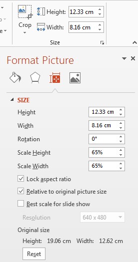
Use the options to set the image size
Now you can adjust, modify, crop and generally change your picture completely within PowerPoint.
Corrections

In case your picture isn’t picture perfect you can make some basic corrections like sharpening or softening the image or alter the brightness levels. These are all presets so you will not have the same level of control as you would in Photoshop. But for a quick fix…not bad.
Color
Here’s where you can unleash your inner Andy Warhol. Pick from a range of settings to alter the colours within your picture.
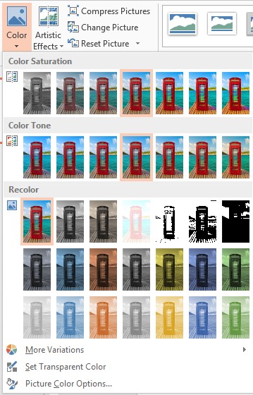
If you find the preset option limited, then click on the further options at the bottom of the COLOR window.
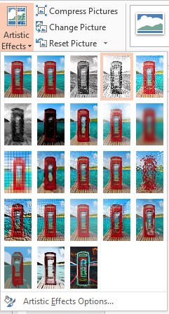
Artistic Effects
Another set of ready-made effects for you to apply to your images, and once again there are additional option at the bottom of the ARTISTIC EFFECTS window should you need them.

Both the COLOR and ARTISTIC EFFECTS options are things you can easily play with, experimenting with various combinations to see what sort of interesting effects you can create. Perhaps not the most useful thing when preparing a business presentation, but fun.
What will be of use, is the ability to compress images.
Compress Pictures
Digital photos are getting bigger and bigger in terms of file size. Most of my photos are around the 6-8Mb size (I dread to think what size they would end up if I shot photos in RAW mode) and if I then adjust the images in Photoshop the size can increase dramatically.
Chance are your company has a limit on file size you can send on e-mail so a presentation with 10-20 full size images soon becomes a problem. So it’s time to compress your images.
In your ADJUST group on the FORMAT tab, click on COMPRESS PICTURES. From the dialog box, select from the options available and reduce the overall size of your presentation allowing you to send it out by mail.

Applying Styles
Add frames, faded edges, reflections etc. to your images. Another fun feature to play with to try and make your images that little bit more interesting.
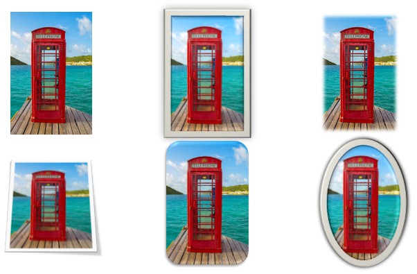
Cropping Images
Sometimes you don’t need all of the image, or perhaps there is something in it that you don’t like or want. So you can crop any part of an image and the nice thing is that once you have cropped an image you can save it as a new image to reuse again elsewhere.
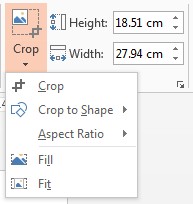
Within CROP you have a number of options, from a basic crop, to fitting your image inside one of the standard SHAPES, cropping to a specific height/width ratio or filling a slide.
To crop a picture click and drag the black grab handles until you get the desired part of the image.
Once cropped, right click on the new image and if you want select the option SAVE AS PICTURE in case you want to reuse the cropped image rather than to go through the whole process again.

Removing Image Backgrounds
This is quite a neat feature. It’s nowhere near as good as Photoshop but it does a pretty good job, especially where you have a plain background that can be easily detected against the part of the image you want to cut out.
Let’s take an example;
I have a picture of me and I want to add it to a slide. OK, no problem there, but the image has a lot of white background which looks a bit messy with a coloured background to my slide.

Ideally I just want a cut out of me without the background so it looks more like it is part of the slide rather than just an image plonked on top.
Select the image and click on REMOVE BACKGROUND on the FORMAT tab.

It tries to work out what you are trying to cut out, and where it gets it wrong you can use the drag handles to extend the selection.

Even after extending it may not include everything you want. See the image below where it has failed to include the bottom of the right hand sleeve and my trousers.

BACKGROUND REMOVAL has its own ribbon and you have the option to MARK AREAS TO KEEP and MARK AREAS TO REMOVE. This may get trickier if you have a busy background rather than a plain one similar to this example.
Click on the area(s) you want to keep or remove until you get you want.

Click on KEEP CHANGES and you then get this;

Not a bad job. If you want to be picky, do the same exercise in Photoshop and see the difference. It’s really at the edges where you see the main difference, especially with hair (and I don’t have much) but you can see the individual hairs on the Photoshop cut out, but they are lost in the PowerPoint one (doesn’t make much difference on my head you might say!) but as I mentioned before, this is being picky and for a presentation, this should be good enough.

Convert Images Into SmarArt
You probably know you can convert boring bullet points into SmartArt…well, you can do the same with images.
Import a bunch of photos…don’t even bother resizing them on your slide.

Go to the PICTURE LAYOUT option in the PICTURE STYLES group of the FORMAT tab.

Pick any layout you like the look of and PowerPoint will rearrange your images into that layout, resizing/cropping photos to fit automatically.

Note: to get the island picture as the main one, it needed to be moved to the back of the stack of images to effectively make it the first picture chosen.
So now when you want to add images to a presentation you are no longer limited to basic image display, you can crop, alter, cut out and present them in interesting layouts. Ultimately, banish those boring bullet points forever, give your viewers something interesting to look at and listen to what you have to say.
Happy presenting!
PowerPoint – Creating Custom Graphics (Shiny Spheres)
Although there are lots of images you can download or copy from a variety of sources, sometimes you can’t find exactly what you want. The only way to get around this is to create your own custom shapes and images.
Although PowerPoint won’t ever have the functionality of Adobe Illustrator or Photoshop, with a handful of tricks you can create some fairly neat graphics to spruce up your presentations rather than stick to usual set of clip art or shapes available to you in the standard menu.
How about creating something like this…

What we are aiming to create…
Ok…a shiny sphere…what use is that? Let’s not forget that PowerPoint is there as an aid to presenting, not the presenter. Using abstract images or graphics can help to convey a message across rather than ram it down your throat. The explanation of the graphics is down to the presenter – after all it’s the presenter that the audience has come to listen to, not read page after page of bullet points (yawn!!).
So how do we create this marvel? I will show you two methods: one quick and simple, the other more involved and gives you more control over the end effect.
Method 1 – the more involved method:
From the INSERT tab, select SHAPES and select the OVAL from the BASIC shapes section. Note that circles are not an option in Microsoft drawing tools.
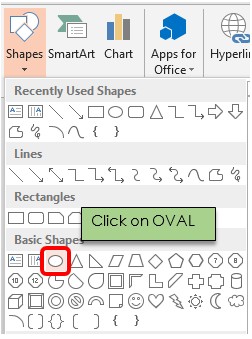
Selecting OVAL to create a circle
To create a perfect circle hold down the SHIFT key while you drag the cursor, otherwise all you get is as the shape name suggests, an OVAL.
From the FORMAT tab go to SHAPE OUTLINE and remove the OUTLINE to your circle.

Remove the outline to a shape
Next we need to fill the circle with a GRADIENT FILL. Right click on the circle and select FORMAT SHAPE.
Then make the following settings:

- Select GRADIENT FILL
- Set the TYPE to RADIAL
- Set DIRECTION to FROM CENTER
- Make sure you only have 2 GRADIENT STOPS. Set a light colour at 0% (far left) and a dark colour at 70%. In this example I have used Blue-Grey, Text 2, Lighter 80% for the lighter colour and Blue-Grey, Text 2, Darker 50% for the darker colour. You can of course whatever combination you want.
I am using PowerPoint 2013 here but the same settings can be achieved in earlier versions too.
Now add a second smaller OVAL/CIRCLE on top of your first circle. You can use either a circle or an oval, your choice, whichever you think looks best. I will add an oval in this example.
Again you will need to apply similar settings to your first circle…no outline, gradient fill etc. but this time with slightly different setting on the GRADIENT FILL.

Settings for the smaller sphere
- Set the TYPE to LINEAR
- Set DIRECTION to LINEAR DOWN
- Set the first stop (far left) to WHITE and use the same dark colour as before for stop 2 but this time set it to 80-85%
- Set TRANSPARENCY to 100%
The final step is to add a SHADOW under the sphere.
Click on the main circle (you don’t want to create a shadow for the smaller one), then right click and select FORMAT SHAPE again, but this time pick the EFFECTS section and select SHADOW. Go for any setting you like. In this example I have used the following settings:

Shadow settings for your sphere
Method 2 – the quick and easy way:
Create your circle, removing any shape outline, exactly as outlined in the steps above.
On the FORMAT tab look at the SIZE of your circle and make a note of the size shown.

Size of your shape
Now right click on your circle and select FORMAT SHAPE. Go to 3-D FORMAT and set both the TOP and BOTTOM BEVEL to ROUND.

Bevel setting
You now need to set the WIDTH and HEIGHT values. To set this correctly and quickly, you’ll need the size of the circle you created. To calculate the correct values for your circle you have to do a quick calculation;
- If working in centimetres – diameter x 14
- If working in inches – diameter x 36
Apply the calculated number to width and height for both top and bottom bevels. So using my example here, the values would need to be set to 9.22 x 14 (my laptop works off metric measurements) to give a value of 129.08, which I have rounded down to 129.
The end result then looks like this;

Quick sphere
This gives a perfectly acceptable result and creates a complete sphere that you can rotate which changes the lighting slightly across the surface.
Whichever method you choose to use, you can create as many of these as you like in any colour you like to match your presentation theme.

Spheres in various colours. With a bit of added animation you can turn these into a Newton’s cradle!
How you then choose to design your own graphics is entirely up to you and the message you are trying to get across to your audience.

Using spheres with some added 3-D images
Although this sort of thing takes time, the end result is worth it, and with practice it takes less time, and ultimately you can move away from the standard dull/unimaginative bullet point/clip art type presentation that send people into a presentation weary comatose state. Even if they don’t think the topic is interesting, at least they might show some interest in your amazing graphics!
Now go and get creative.
